Led the Roku Tips Channel's rebranding and redesign, delivering user-friendly and clear navigation with a new templatizable visual design and a modular After Effects animation system.
Software:
Figma, After Effects, Sketch, AEUX, and Illustrator
We had feedback from the original channel:
Pros:
A. The channel has good organic viewership. | B. The videos have valuable information for our customers.
Cons:
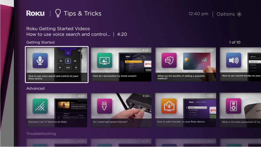
A. There is an opportunity to improve cohesion in the channel's motion design and visual identity. | B. The complicated information architecture and UX design present an opportunity to enhance discoverability. | C. Videos are too long and difficult to follow.
OVERALL INTENT:
The primary objective was to develop a new visual and motion design system for the Roku Tips Channel, informed by user feedback, to ultimately improve engagement and the discoverability of Roku features for all customers.
VISUAL DESIGN SYSTEM
PROCESS:The project involved two distinct levels of branding: 1. The overall channel, which included logos, background colors, and the channel tile. 2. The templatizable thumbnails with the title of every video and the information architecture and grid arrangement inside the channel.
1.
My approach explored two logo and channel tile styles: one aligned with Roku's existing design language and iconography, and another, more playful option incorporating emojis to potentially enhance user engagement and delight.
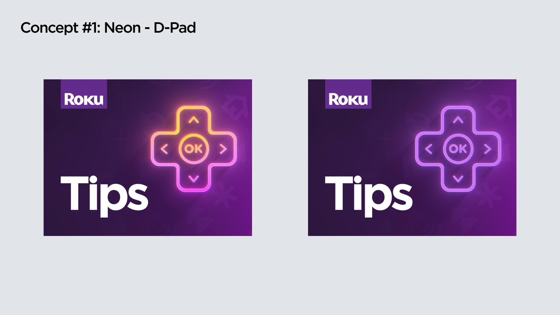
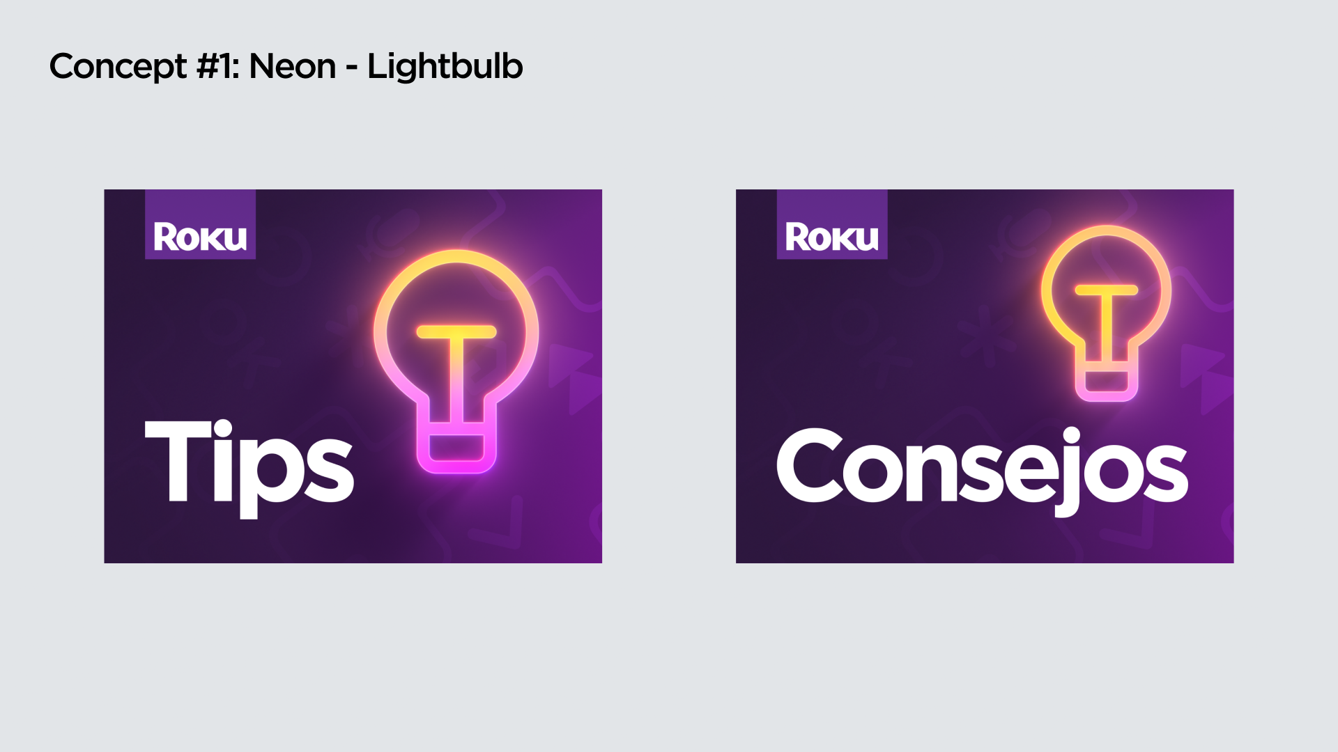
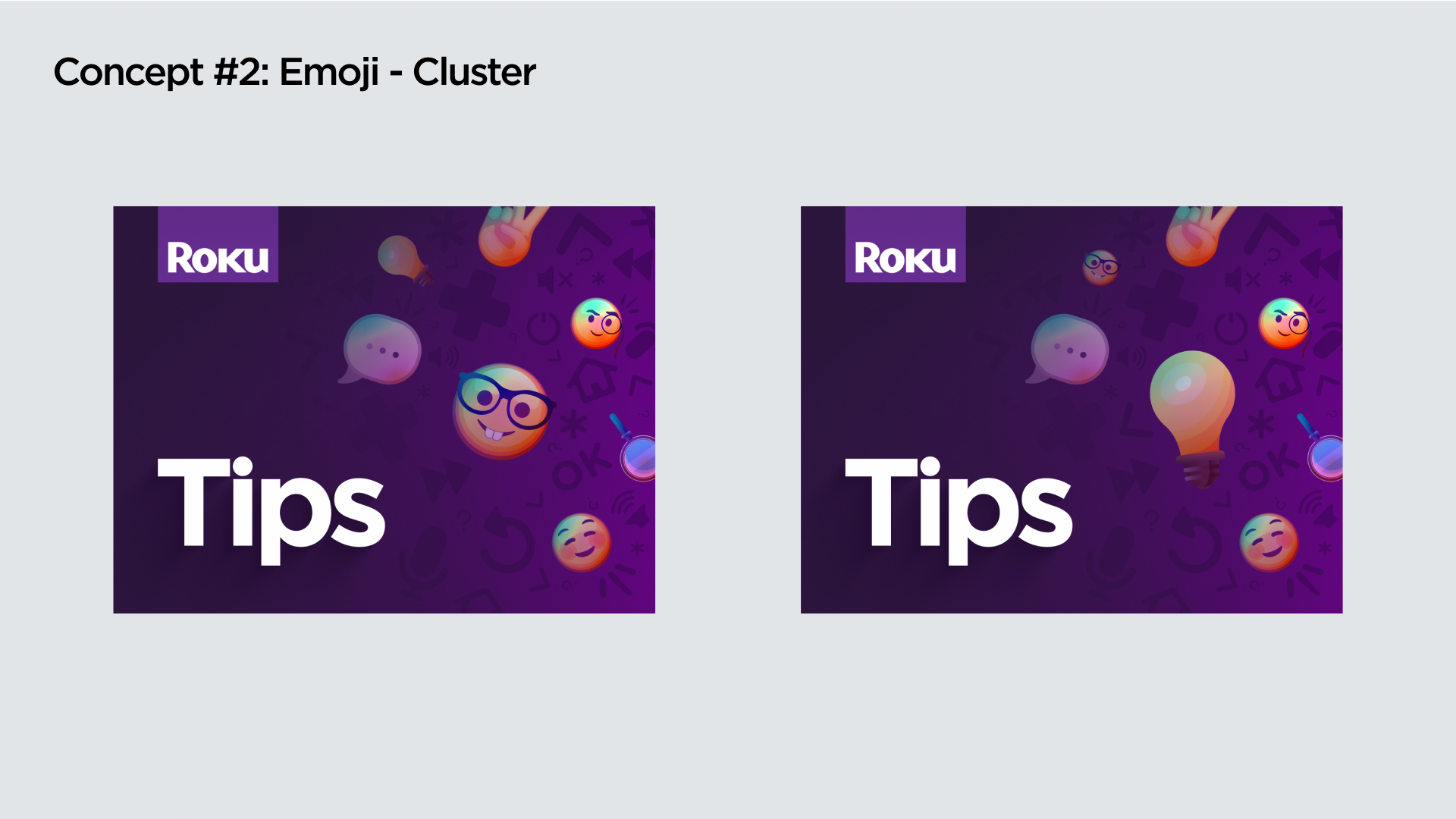
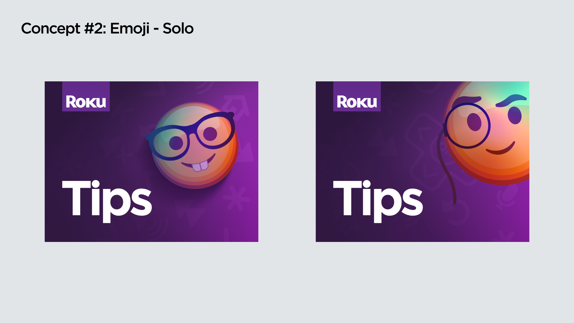
Following extensive design exploration, user testing revealed that initial mockups retaining the original "Tips & Tricks" channel name lacked immediate user recognition. This key insight drove the simplification of the name to "Tips," leading to the creation and successful validation of new design concepts through further user testing.
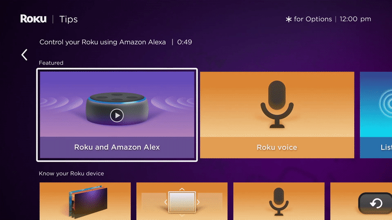
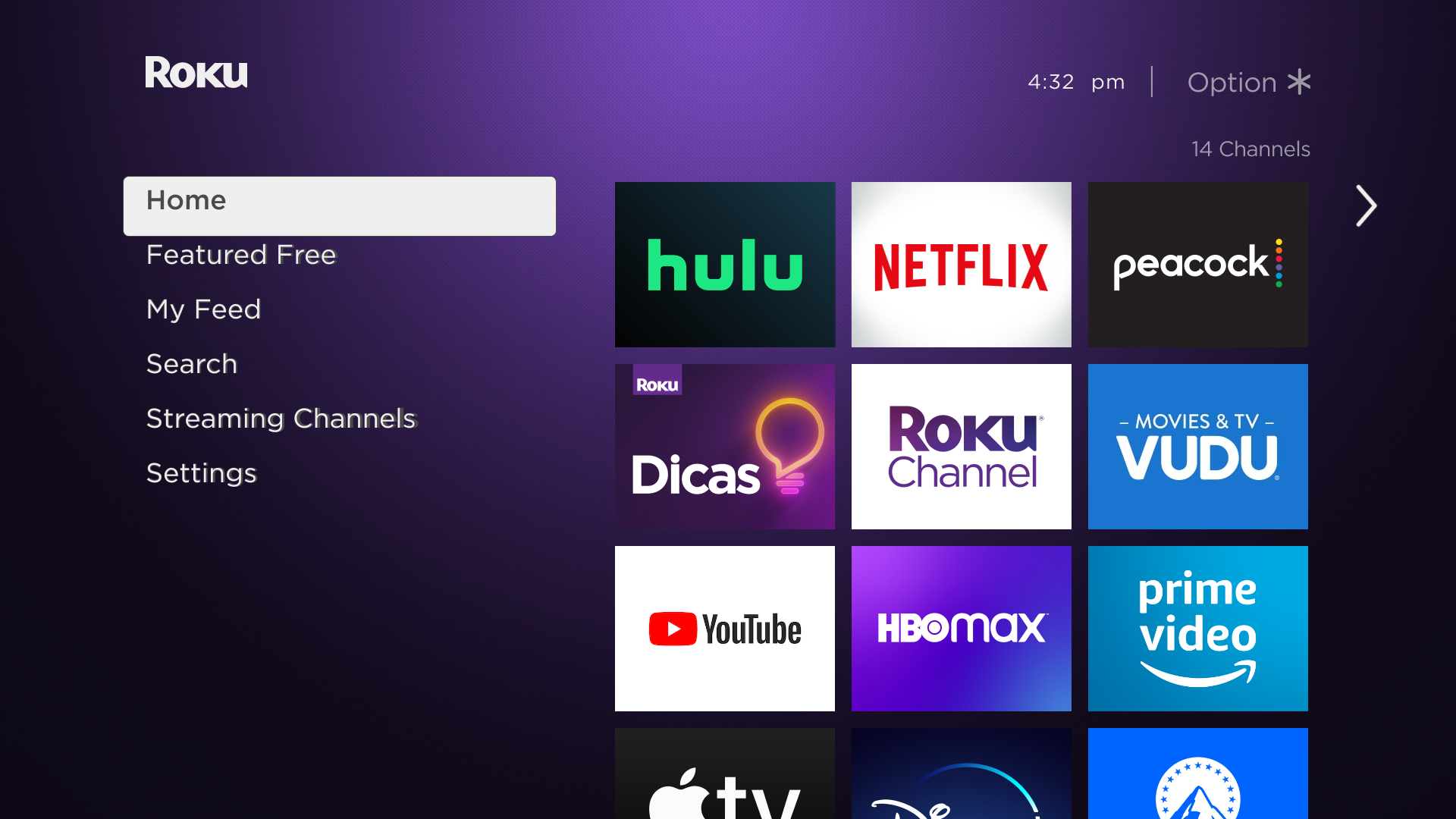
FINAL LOOK HOMESCREEN


2.
I recognized the need for clearer visual clarity on thumbnails and the need for a new channel information architecture. My approach focused on two main areas. To implement a consistent design system for thumbnails, incorporating strong branding and visual hierarchy for better user understanding. Additionally, to restructure the channel's information architecture to create a more intuitive and discoverable experience for users.
Process:
New designs employed a simplified visual language and integrated the illustrations of the motion design system that was being created to fulfill the rebrand of the videos. (which I art-directed and helped create)
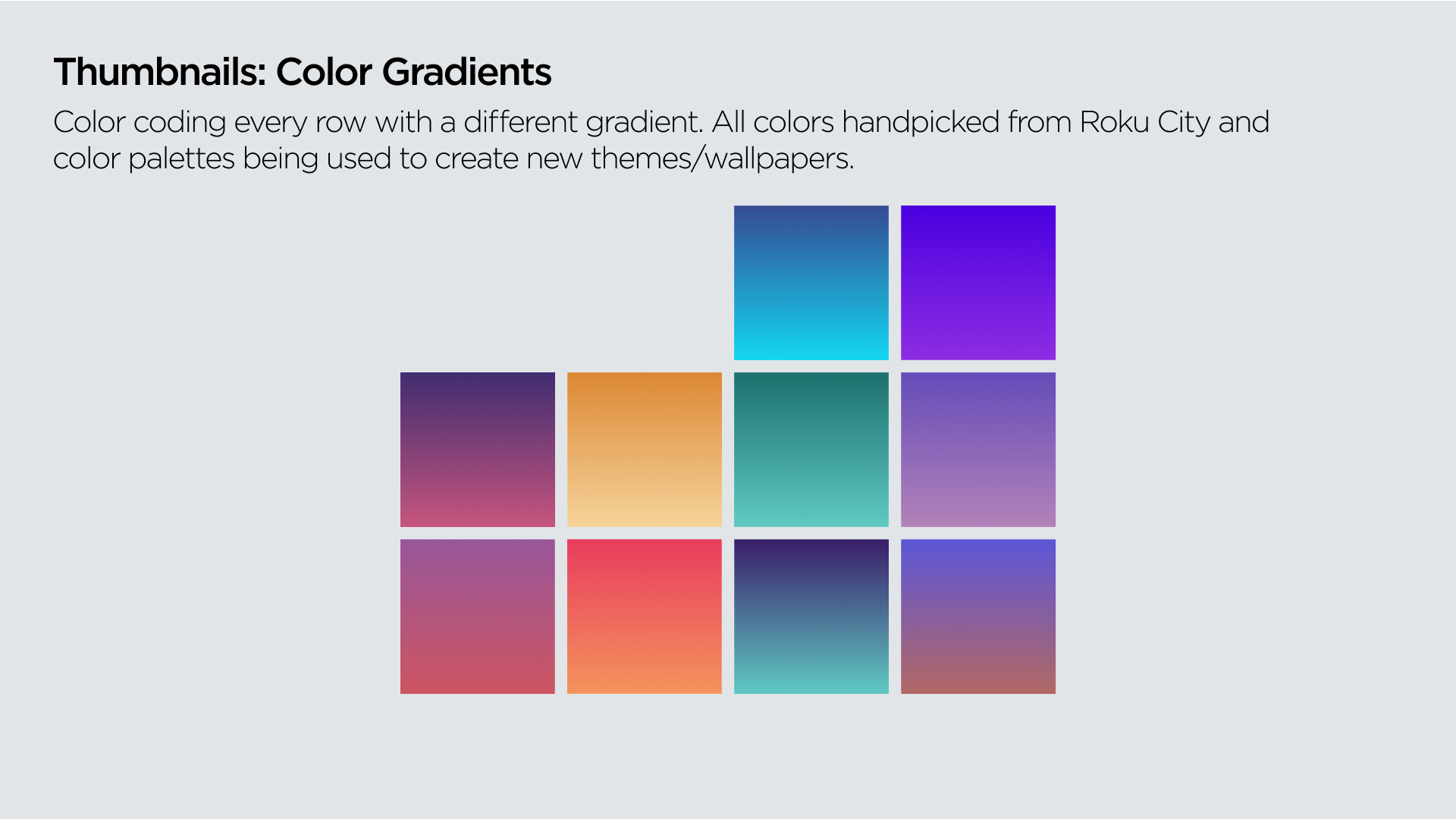
To achieve visual cohesion, key elements from each video were integrated into thumbnail mock-ups, accompanied by simplified text and video titles, as well as an intent to color-code every tile or row.

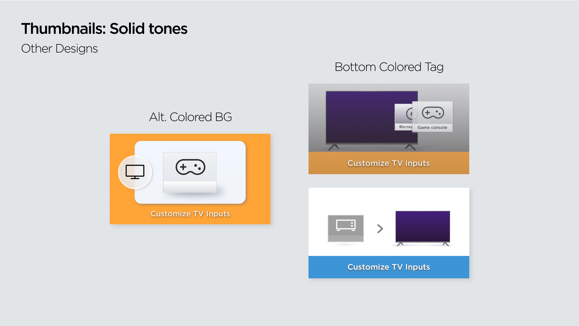
Guided by accessibility and brand guidelines, I developed a color palette incorporating existing Roku brand colors and creating visually appealing gradients.
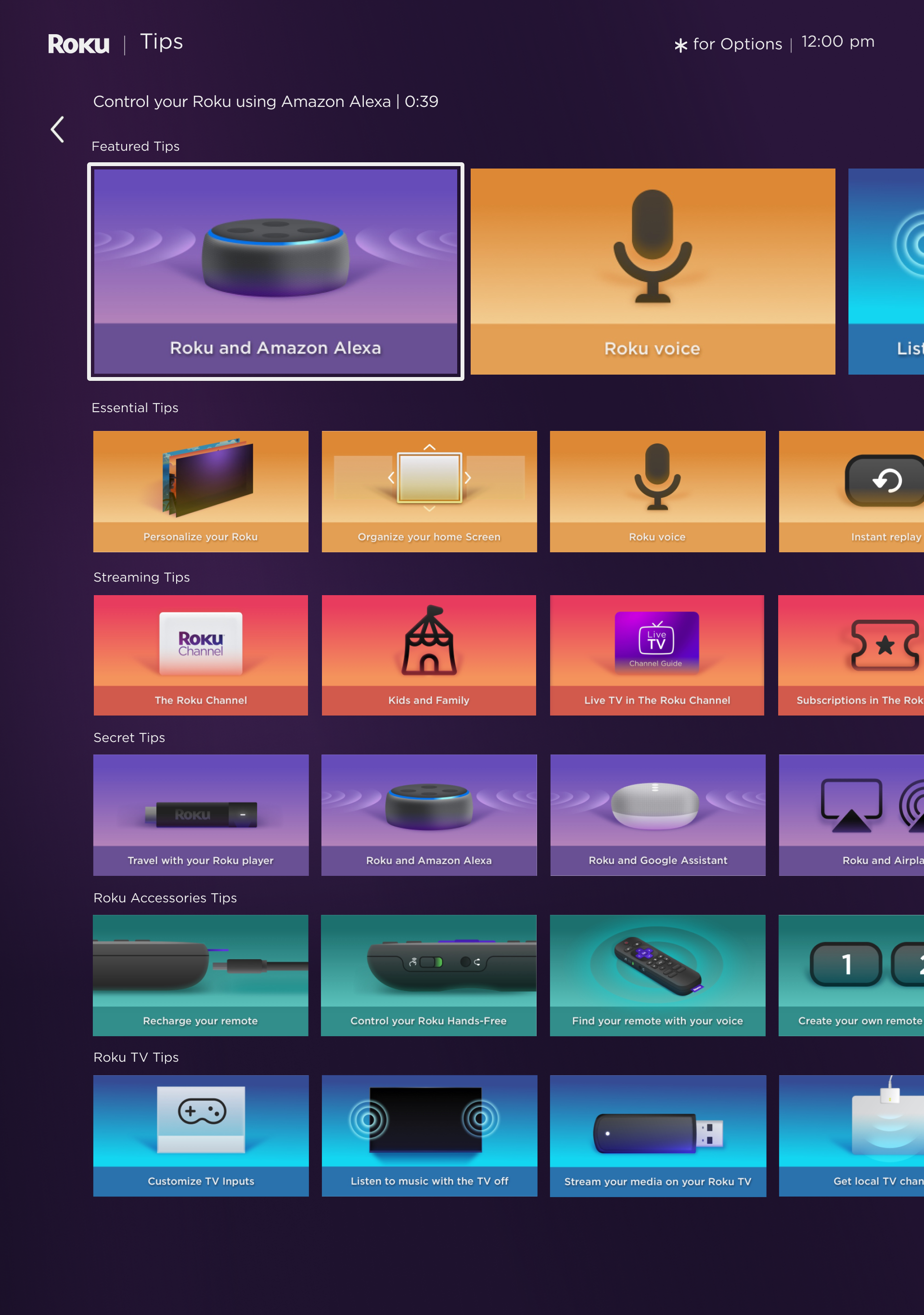
User testing overwhelmingly favored the designs for their clarity, visual appeal, and engaging quality. This feedback validated the content organization, which was refined to prioritize "beginner level" videos at the top while more "expert level" content below the fold and featuring key content in a hero row.
Solutions:
A new design system was put in place with the following elements: A. Key Illustration of Hardware, UI, or Icon. B. Background with one of the selected gradients, as well as pairing them with similar content. C. A text title that included no more than 5 words.