Objective:
Vudu users had long been asking for a left-hand navigation.
Problem:
The discoverability of content had been hindered in the platform by having an unconventional top-heavy menu where the focal element was easily lost.
Intent:
Use motion to test and help UX designers figure out the viability of a left-hand navigation and ultimately sell it to executives.
Process:
Creating blue-sky wireframes and prototypes to test motion and ways in which a new menu would interact with the user.
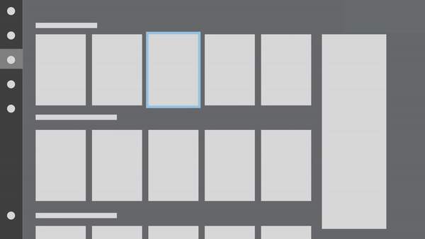
B&W:
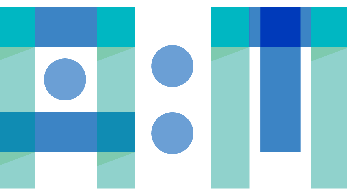
Modular designs with a low amount of detail. Made from wireframes and hand-drawn sketches from UX Designers. The intent was to find alternatives for the menus and how the focal point could stand out a lot better and quickly iterate and show them to PMs to start pitching and writing a feature guide.
Focal point transition from search to search results
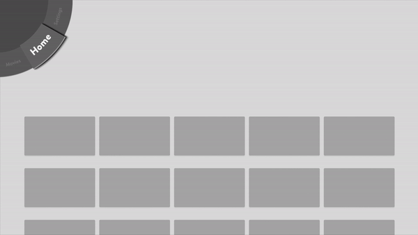
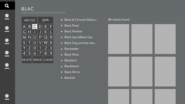
Navigation Exploration
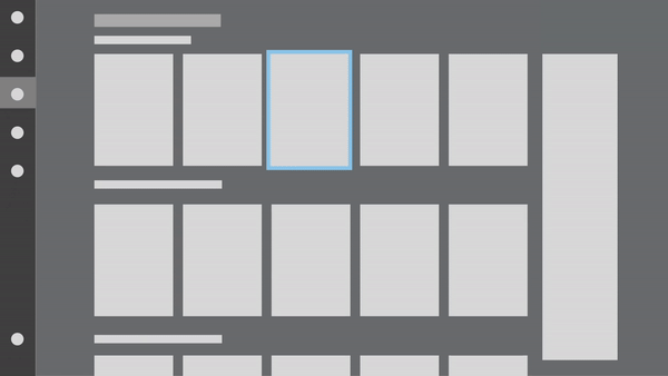
Double Side Navigation
Single Side Navigation
This animation compares having a double menu versus just a single menu. Showcasing for product executives how the motion would work with each option and the visual complexity it might add. As well as taking into consideration marketing needs, where a double menu would limit advertising space.
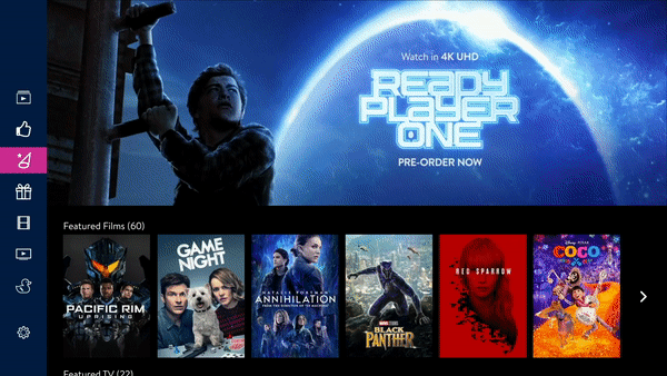
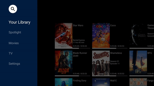
High Fidelity Prototypes:
1) Elaborate high-fidelity renders and UX designs from the favored menus by PMs to have them ready for pitches.
2) Show renders and user flows to engineers so they can better understand the proposed new system ie. transitions, animations, and scrolling throughout the platform.
3) User research the new proposals to further get user feedback
Explorations with full design elements, meant to resemble the real UX. Used to pitch to executives and engineers. Also used for user research. Further experimentation looking for solutions for alternative navigation menus, as well as transitions to improve the visual journey of the user and further improve the clarity of the focal point in the interface. The idea was to look for transitions that were smooth to the eye, which included testing with fades, screen moves, the use of consistent items from one screen to the other, and micro-interactions. Highly favor testing those that helped to tell and reinforce the idea of linear storytelling in the interface. Meaning using small continuous items like the fuchsia lines that animate from one screen to the other, or small key movements in the screen that shift in the same direction as the interface adding a more natural feeling.

Findings:
The users tested favored the left-hand menu change. This allowed PMs to write the necessary feature guide and begin the process of working on the incorporation of the full left-hand navigation into the general user flow.