General info:
The "Tips & Tricks" channel helps new users get acquainted with their Roku and further explore new features and tricks. The channel is automatically installed on the home screen when the user installs their Roku.
Objective:
Redesigning the "Tips & Tricks" app for the current Roku interface. Make videos that have a modern visual design, short-form content, and are localizable to different languages.
Process:
The project involved three main pillars to be considered: Branding of the channel, Launching of a new channel, and Creating new videos.
Software:
Figma, After Effects, Sketch and Illustrator
REBRAND
Problem:
The channel needed a new name that was friendly for localization.
Process:
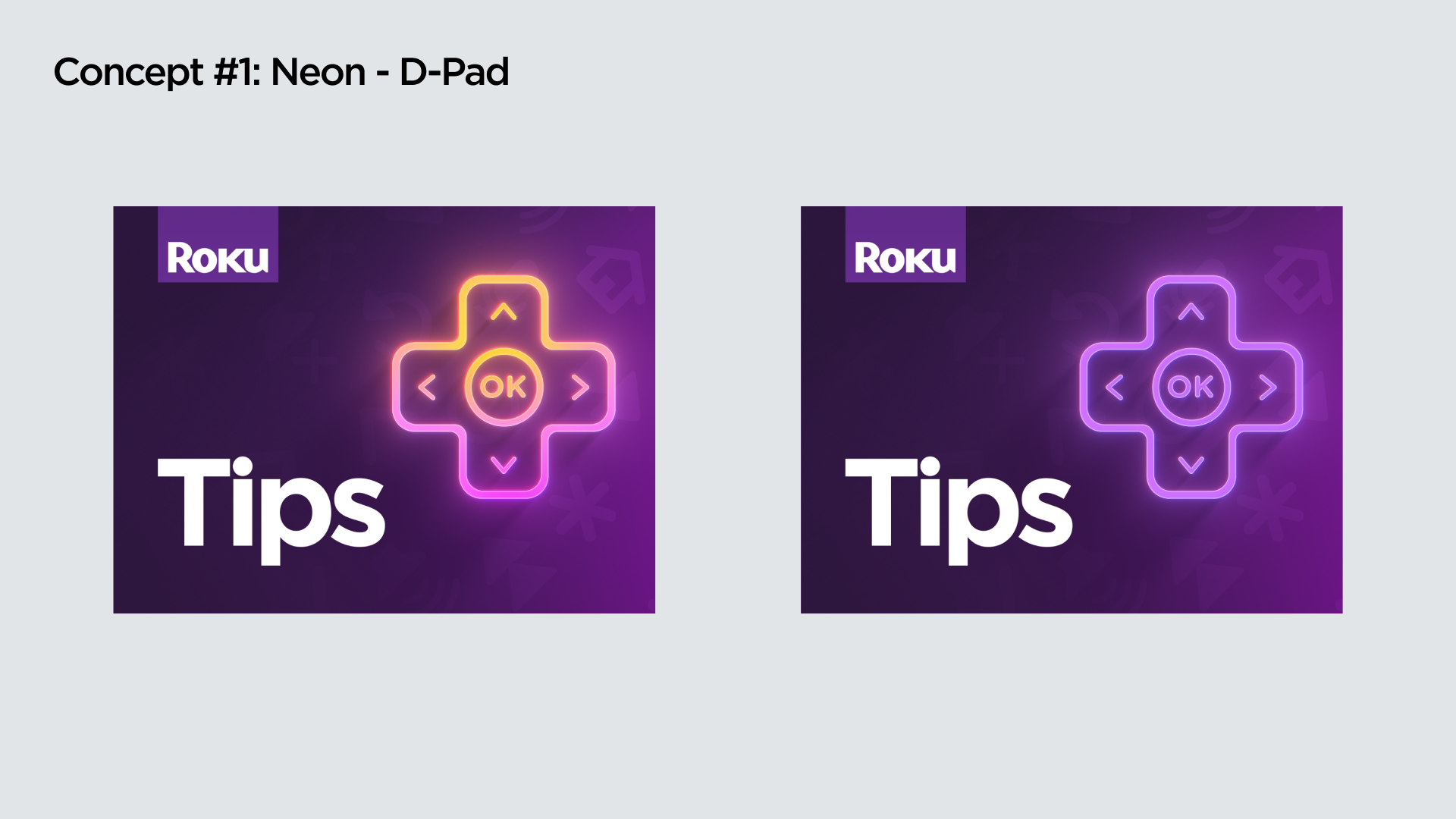
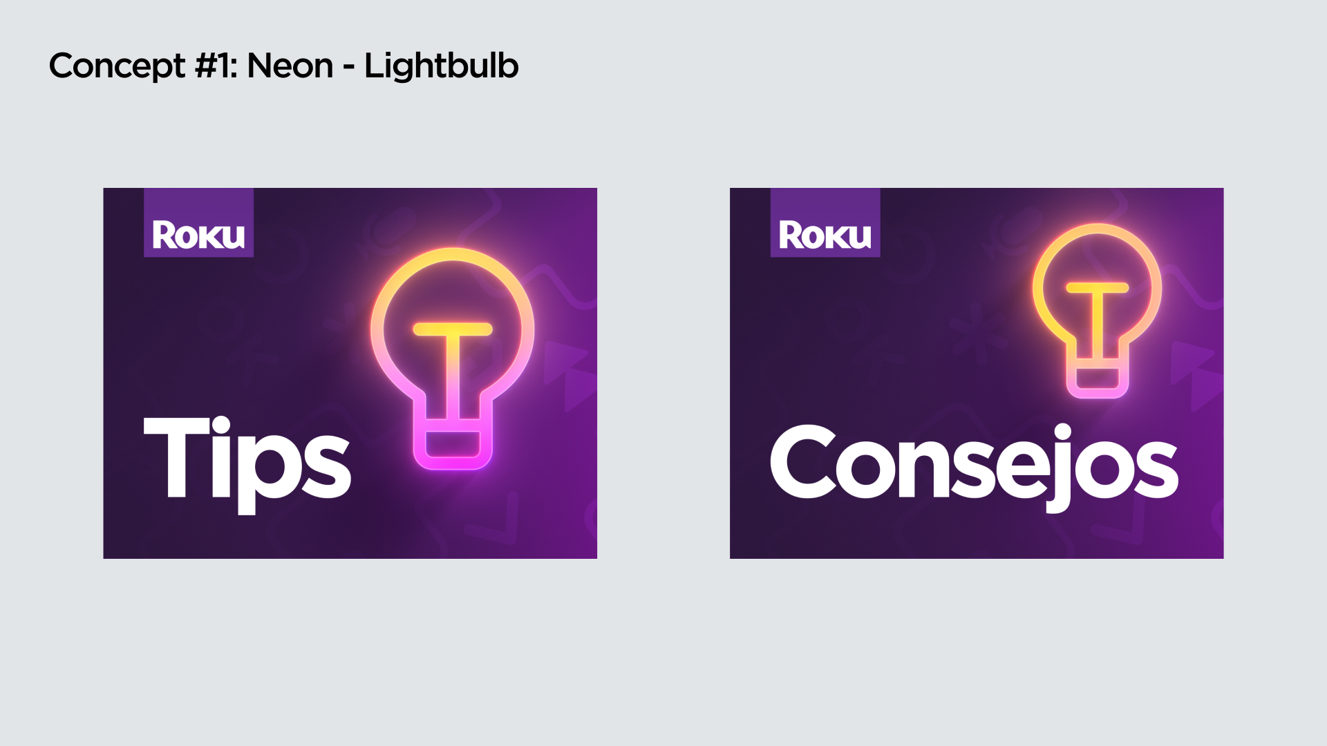
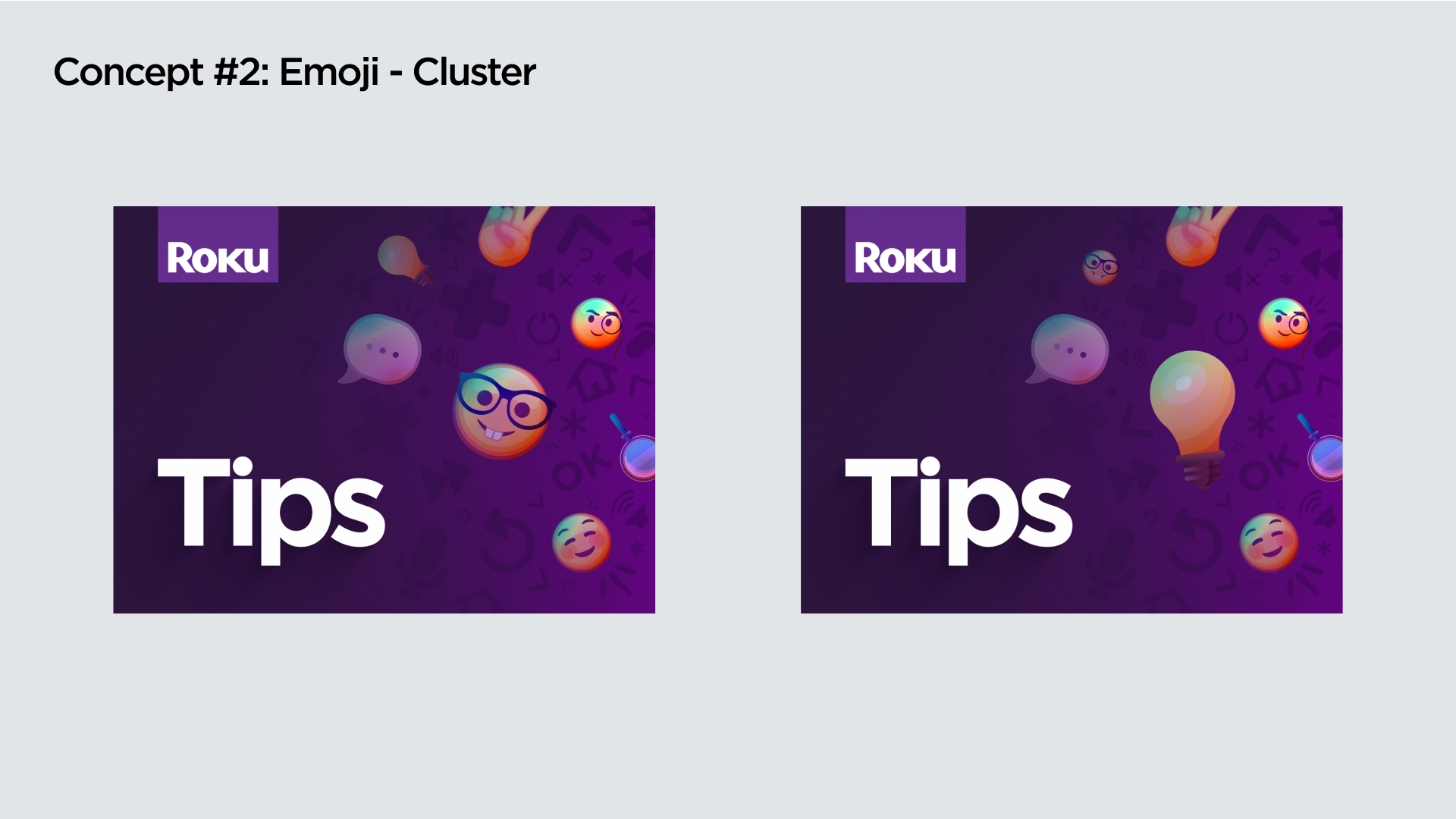
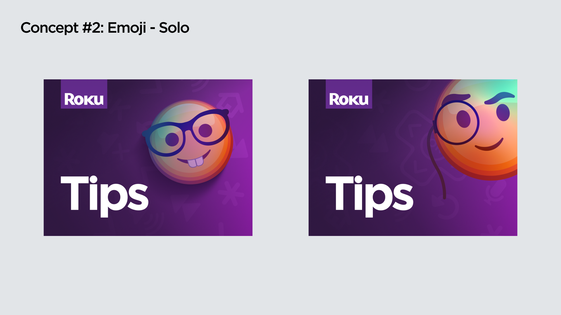
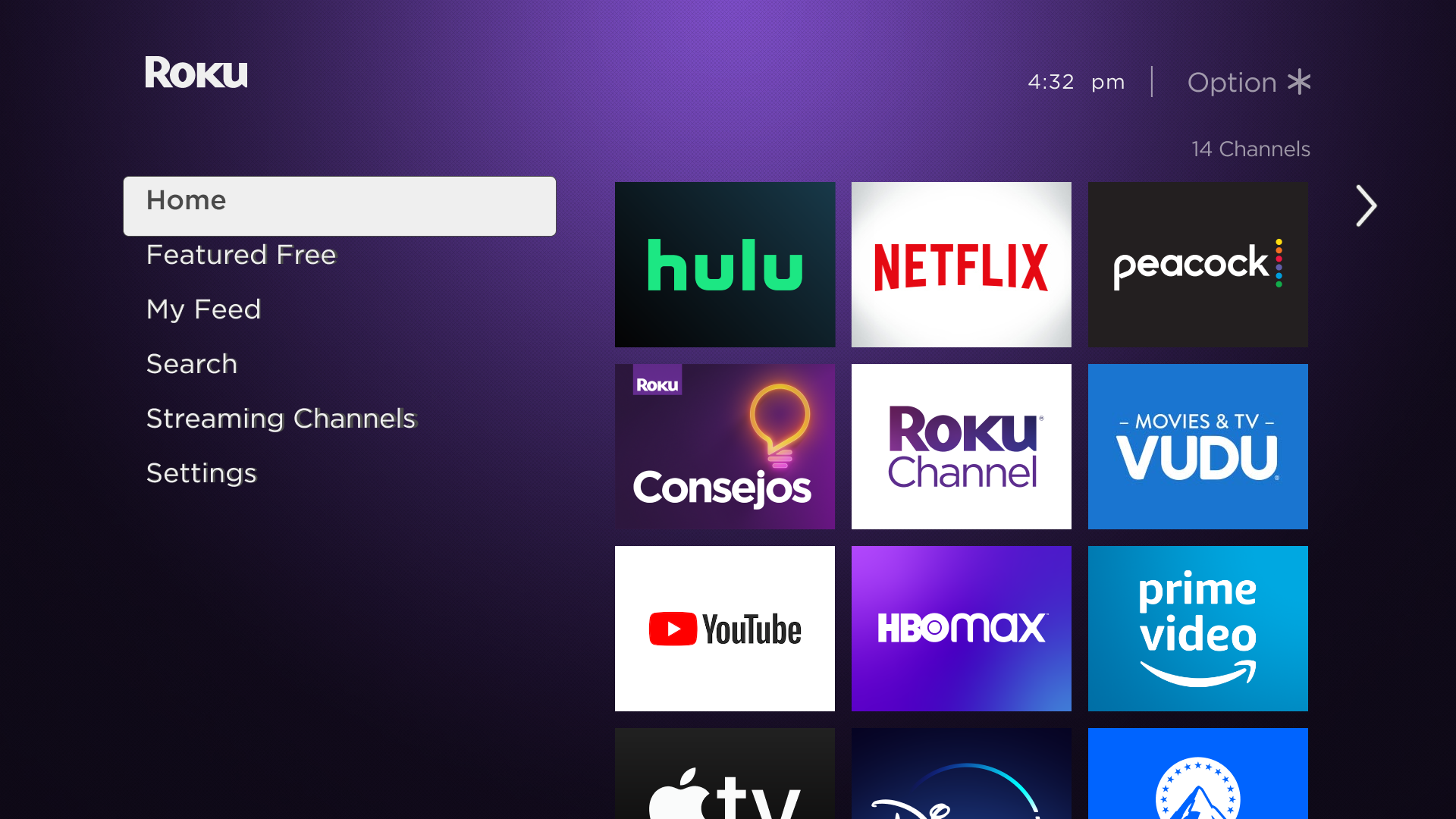
Brainstorming new names for the channel. Later creating mock-ups of the designs. Various designs were approached but the designs picked were those that stood out next to the designs of other tiles on the TV home screen.
UX Research
All designs were user-tested. Most received negative reviews as they were not automatically recognizable by users. A new name was needed and final mock-ups were made with the new brainstorm and tested to find a successful one.

Channel
Problems:
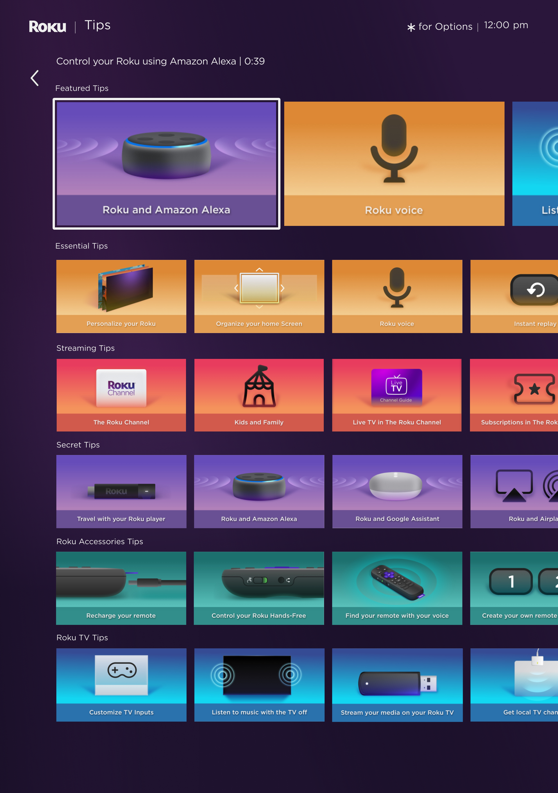
1)The current design system for thumbnails makes it difficult for users to understand what videos are about and accurately distinguish one from the other.
2) The channel has limited customizability, the current channel has convoluted rows and information making it nearly impossible to find a video.
Process:
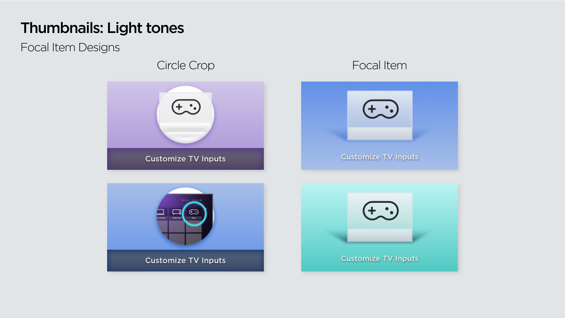
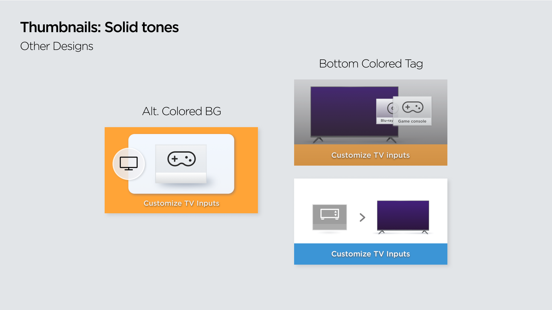
New designs were approached using a simpler visual language as well as using elements from the design system being set in place. Different mock-ups prioritized the readability and information being shared with the thumbnails in the channel.
The information architecture was analyzed and videos were paired in buckets that would make them easier to find. Rows were later organized with the intent of having the simpler and most basic videos on the top and on the bottom videos that are more elaborate and for “expert” users. Collaborated with UX designers and PMs to understand key features in the Roku interface and analyze which videos and screens should be included in the new channel.
Worked alongside engineers, copywriters, content editors, and executives to create the final version of the channel.
UX Research
1) The designs selected were those that received almost 100% preference from users. As they provided “clarity” on the theme of the videos, and also proved to be “visually attractive to the eye, and also fun to watch”.
2)Content organization was favored by users, and was further organized to include more basic videos on the top rows of the channel, as well as using a hero row for the featured videos.
Solutions:
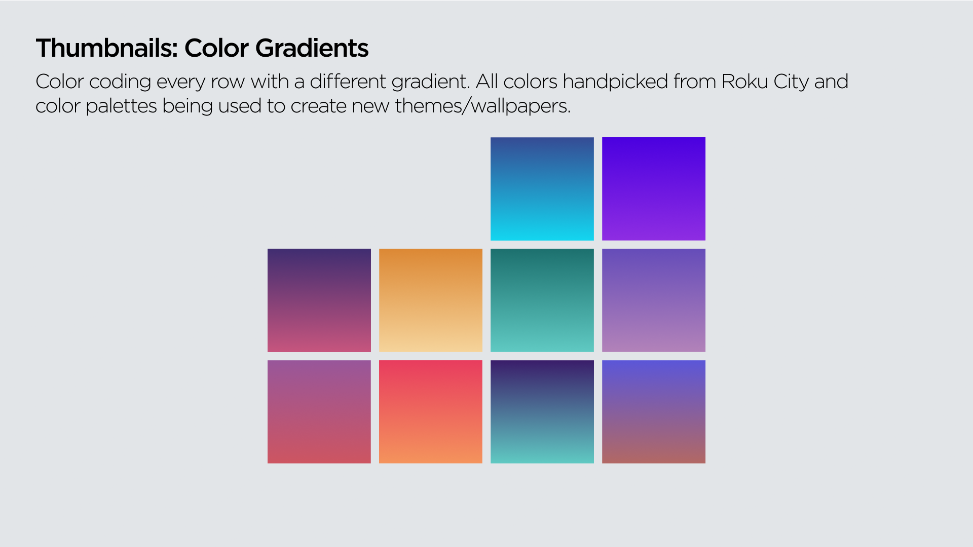
1) Thumbnail designs were finalized using the design system and easy-to-understand iconography favoring 10ft. readability.
2) Videos were further organized to favor the engagement that was suggested by the UX research. Adding a hero row to the channel, as well as organizing the channel into rows that have common themes, and also making “beginner” videos the most accessible for users.
Video redesign
Problems:
The current channel’s videos are too long and elaborate trunking the learning process of the user and their investment in the product. Current videos also were outdated and not on brand with the current Roku style. From the production side videos were not easy to replicate and to localize into different languages.
Process:
Started with the exercise of redesigning current existing videos into different styles that are more in pair with the gradient-centered design style being used by Roku. Boards were created in different styles, as well as test animations. The thought process of all boards was to modernize the brand. The design which was the most straightforward and easy to understand was selected.
Collaborated with UX designers in order to create animated prototypes of all screens needed for the visualization of key features, as well as creating a UI toolkit which helped to animate and translate the interface in different languages through After Effects.
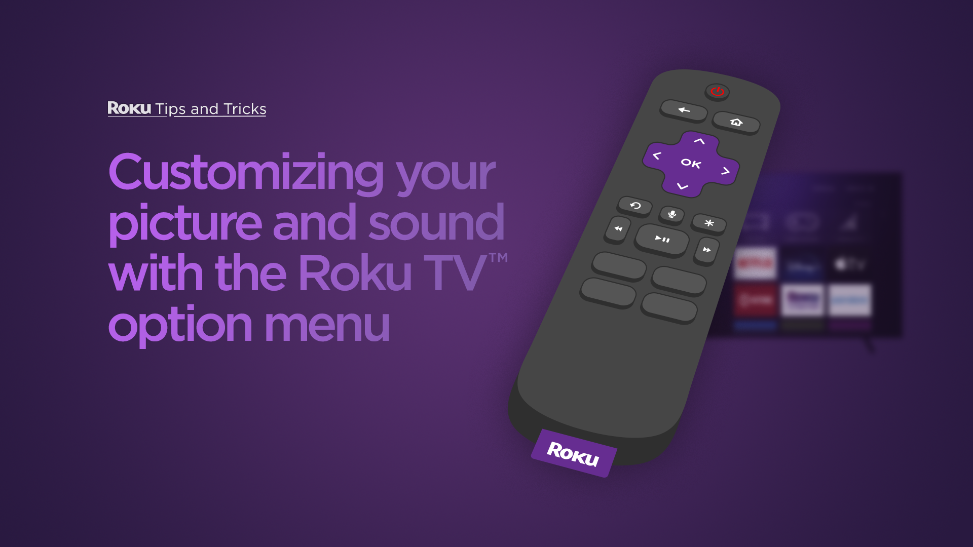
Concept A
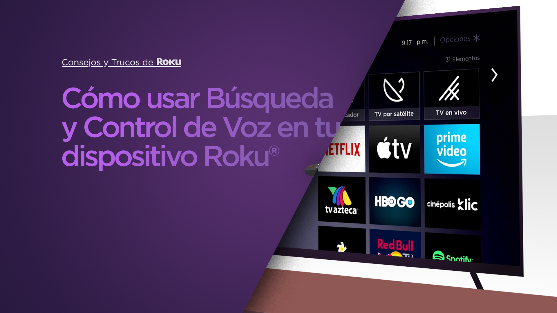
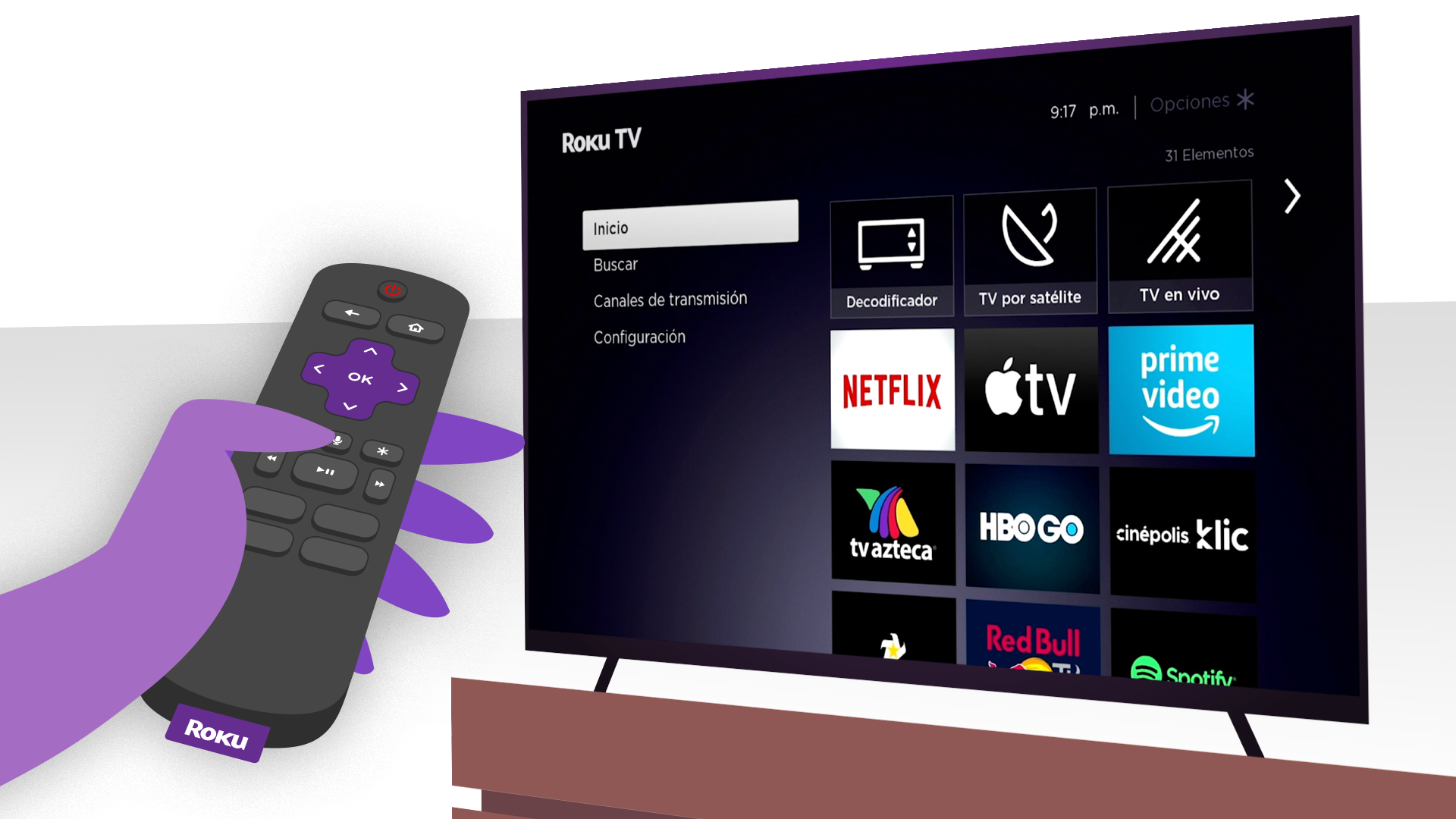
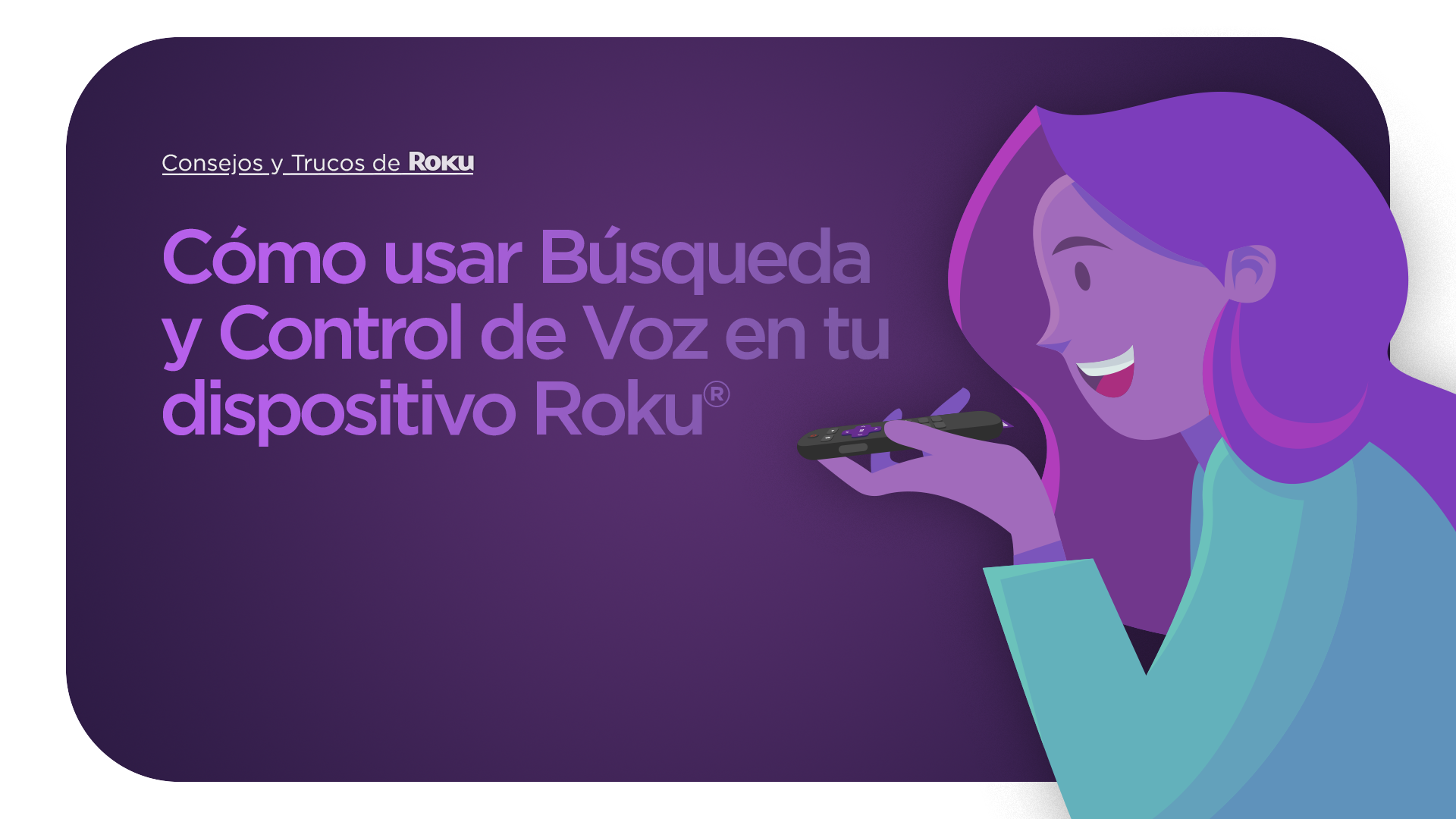
Concept B
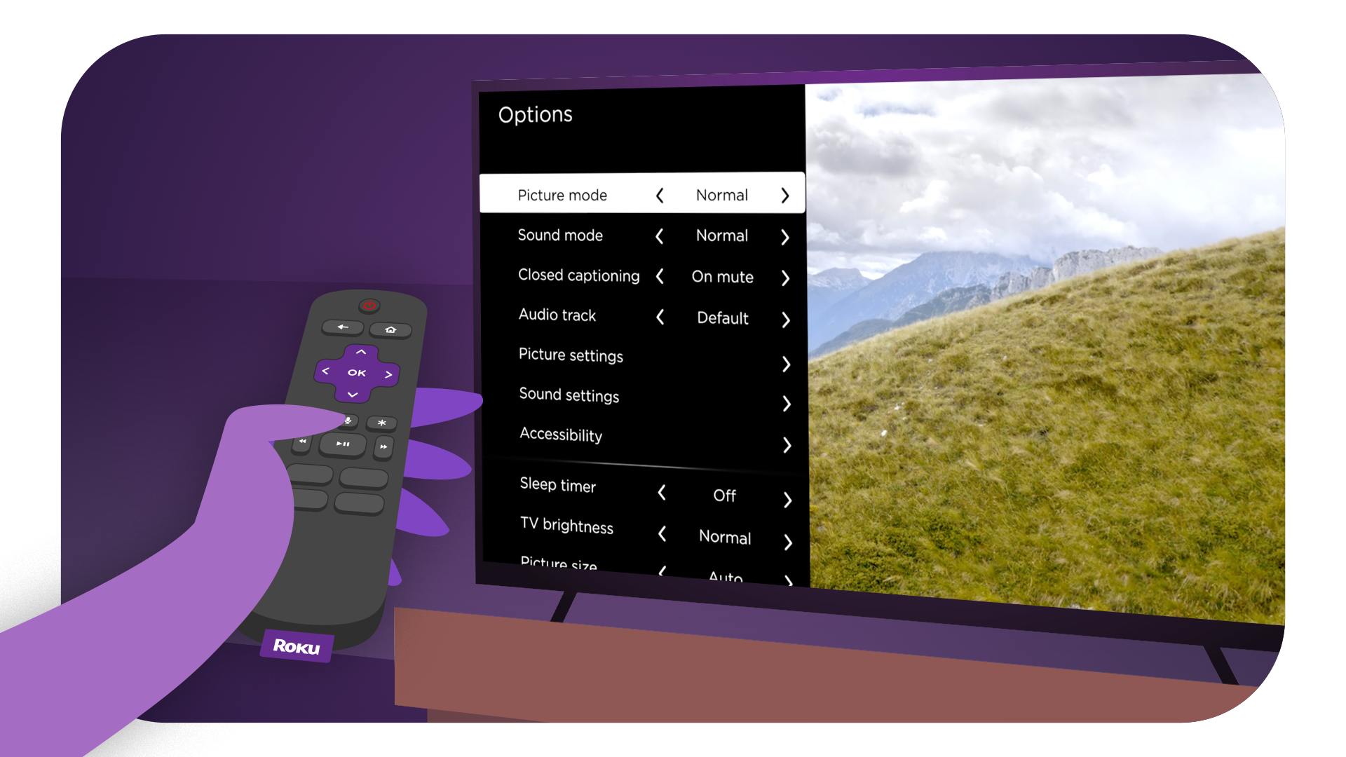
Concept C
Concept D


Concept E


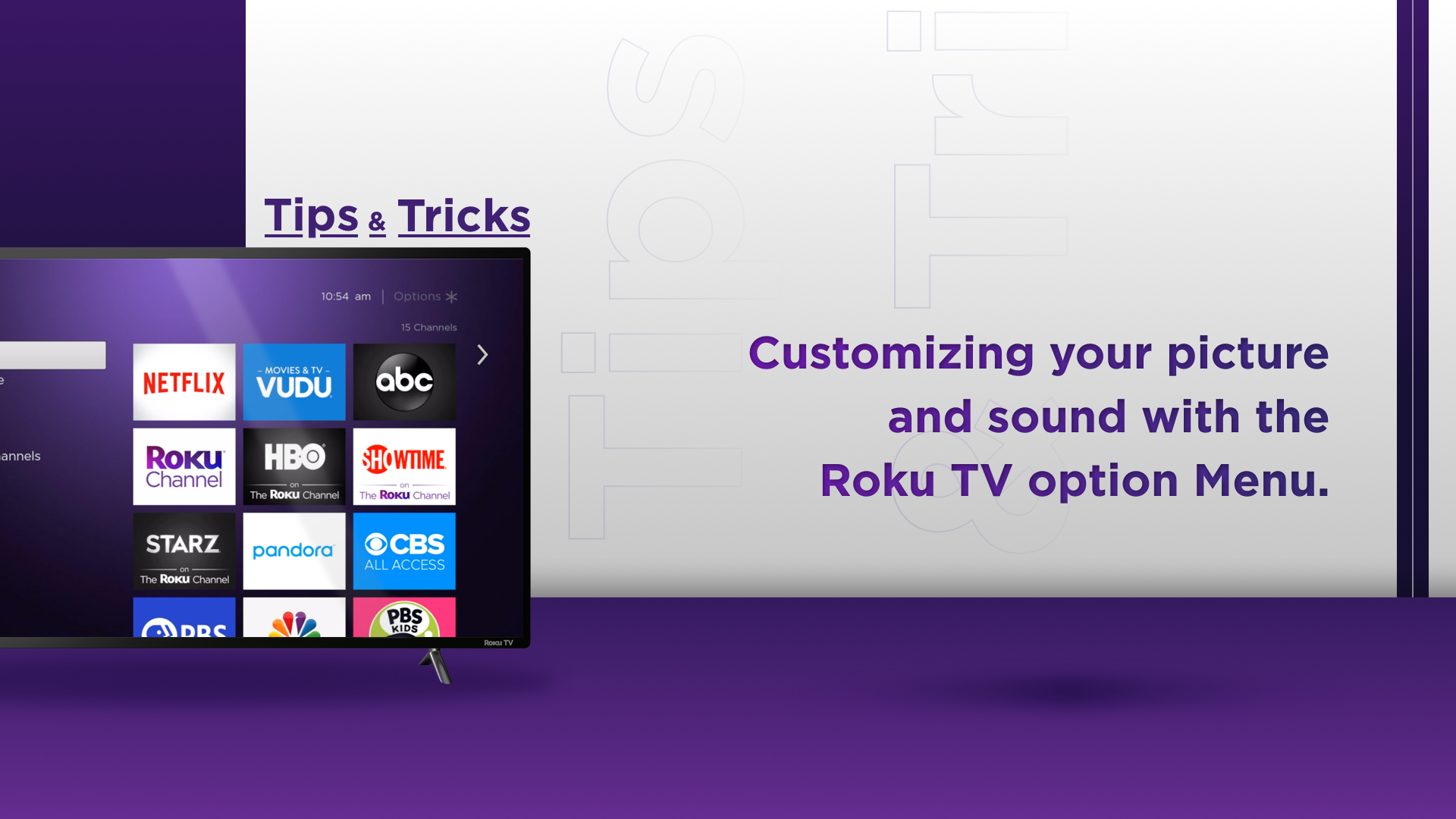
Concept F
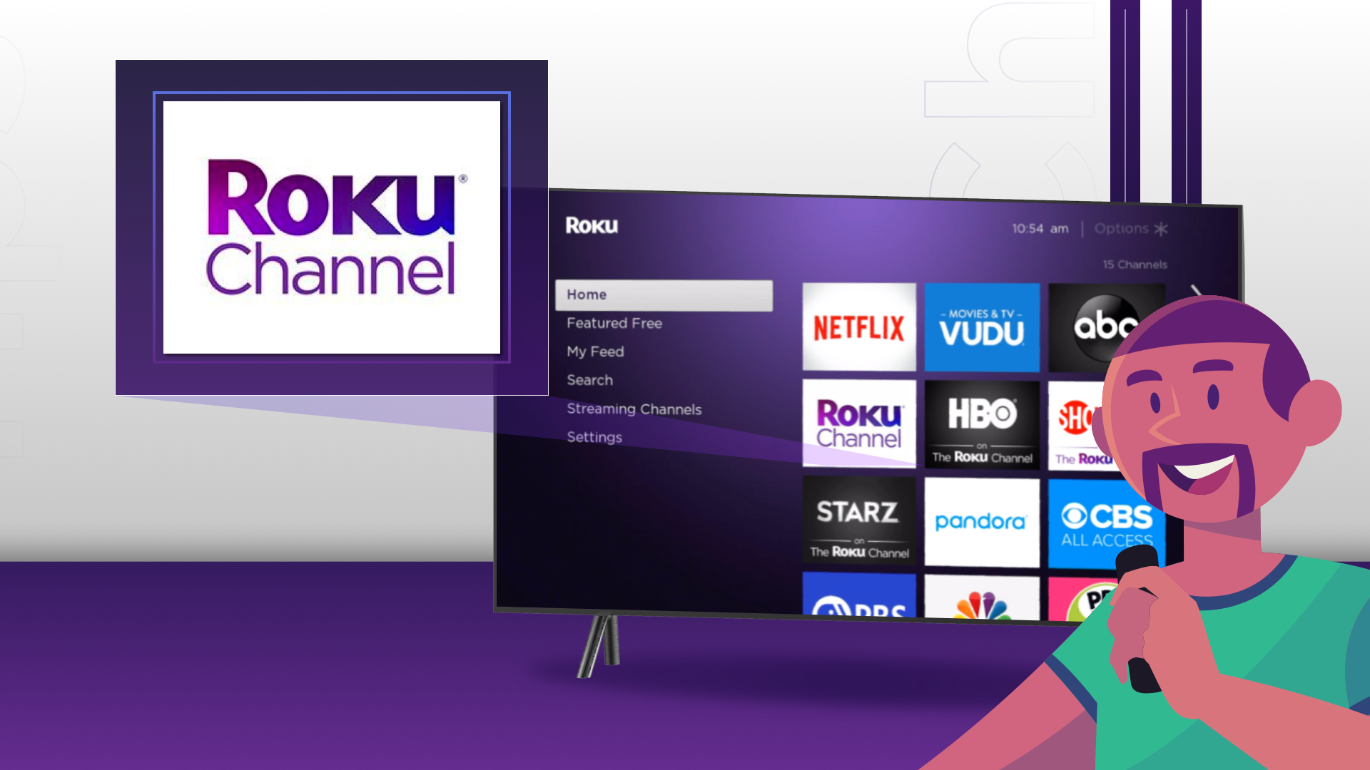
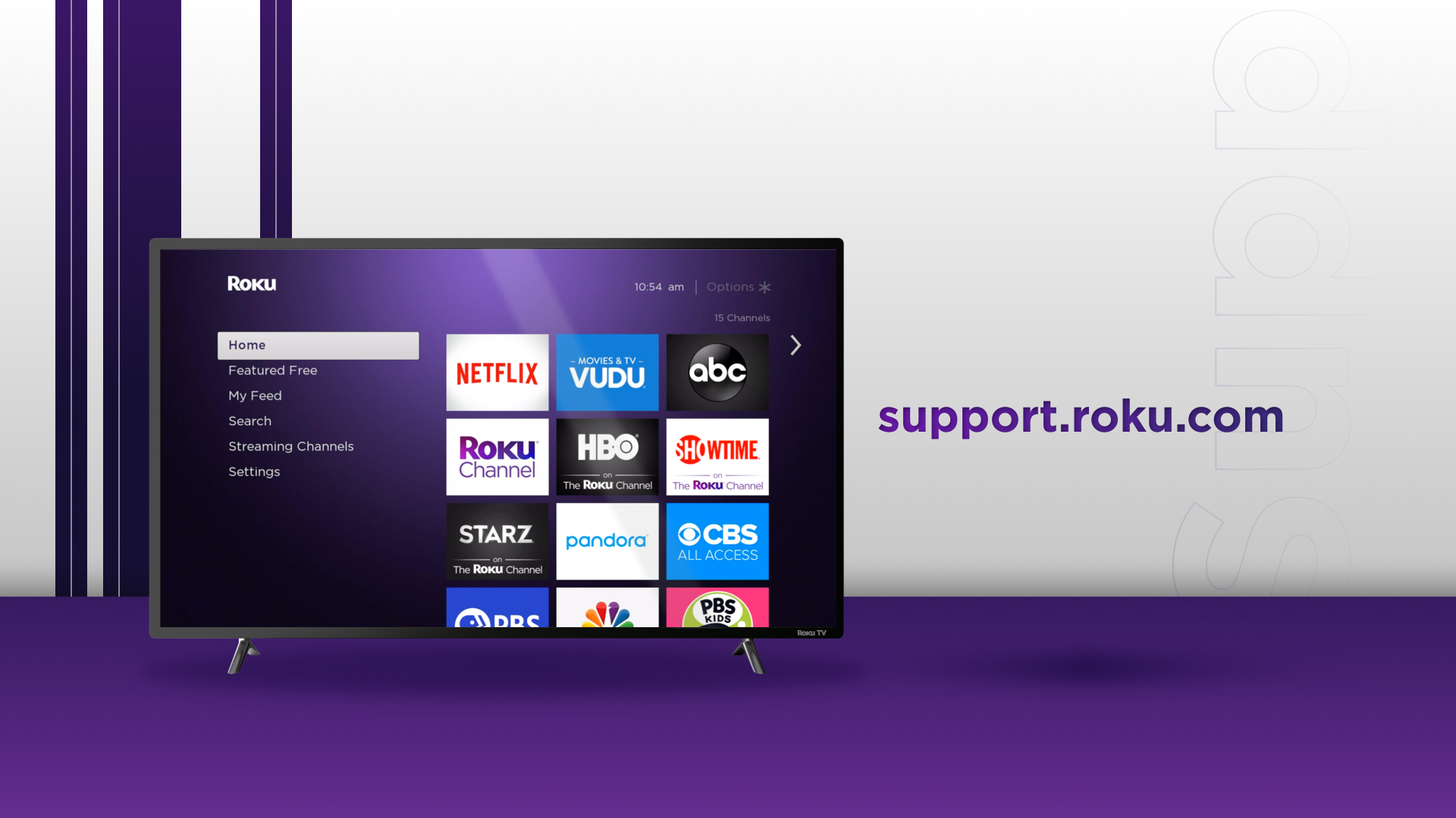
FINAL DESIGN


UX Research
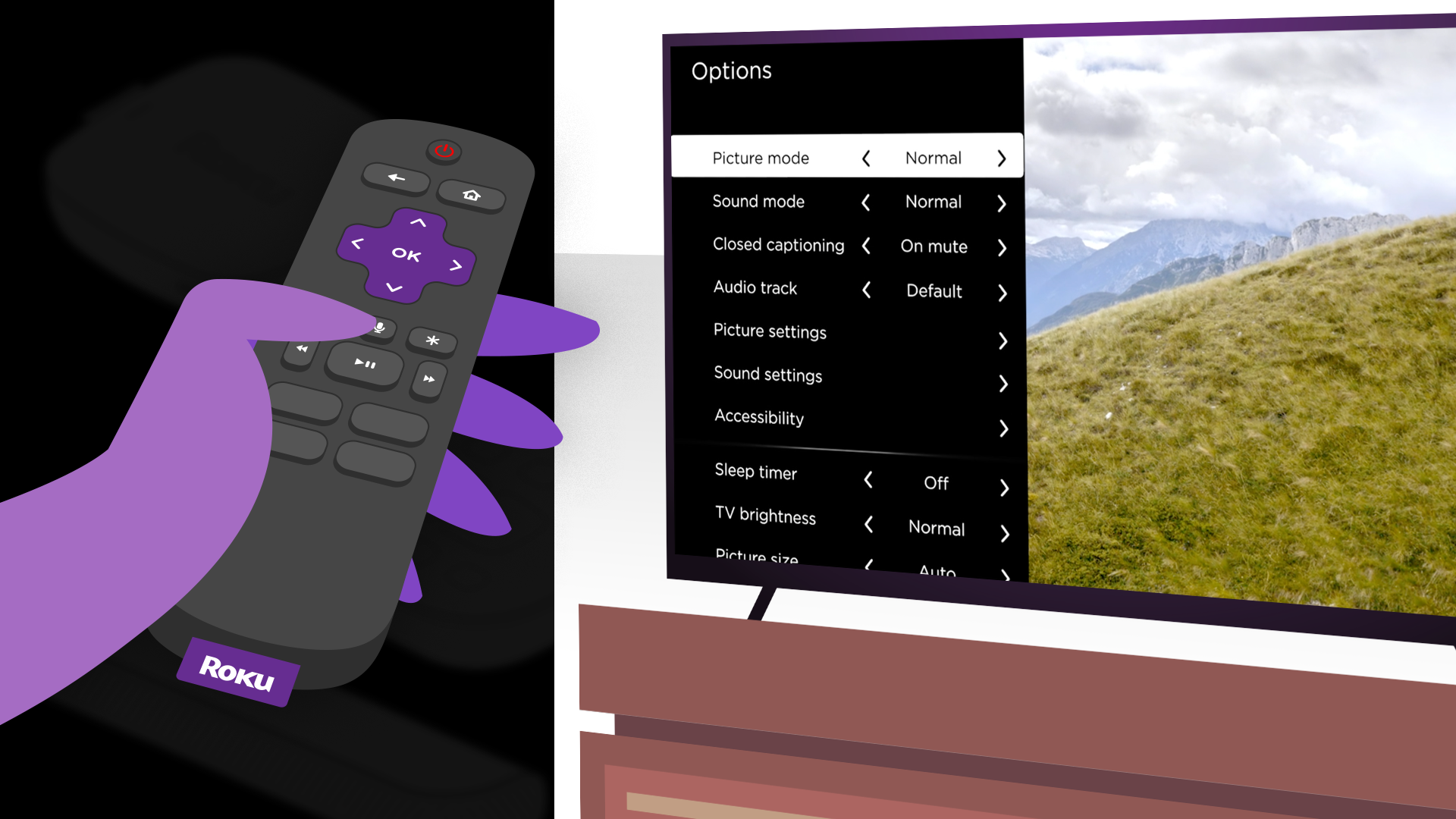
Videos were created and tested with users. The feedback let us know that the style was accurate at depicting simple situations and one-topic-centered videos. All users favored videos that were shorter in length and 90% of the users were able to follow along with the instructions being given by the video, as well as had interest to further pursue the feature being described in the video.
Solutions:
A design system was created in After Effects using the illustrations created by Kyle Jones, in order to create videos faster and in a consistent manner. Modules and components were created in After Effects to make videos easier to translate and also being able to animate the Roku interface with accuracy in different languages.
Illustrations & Motion Library
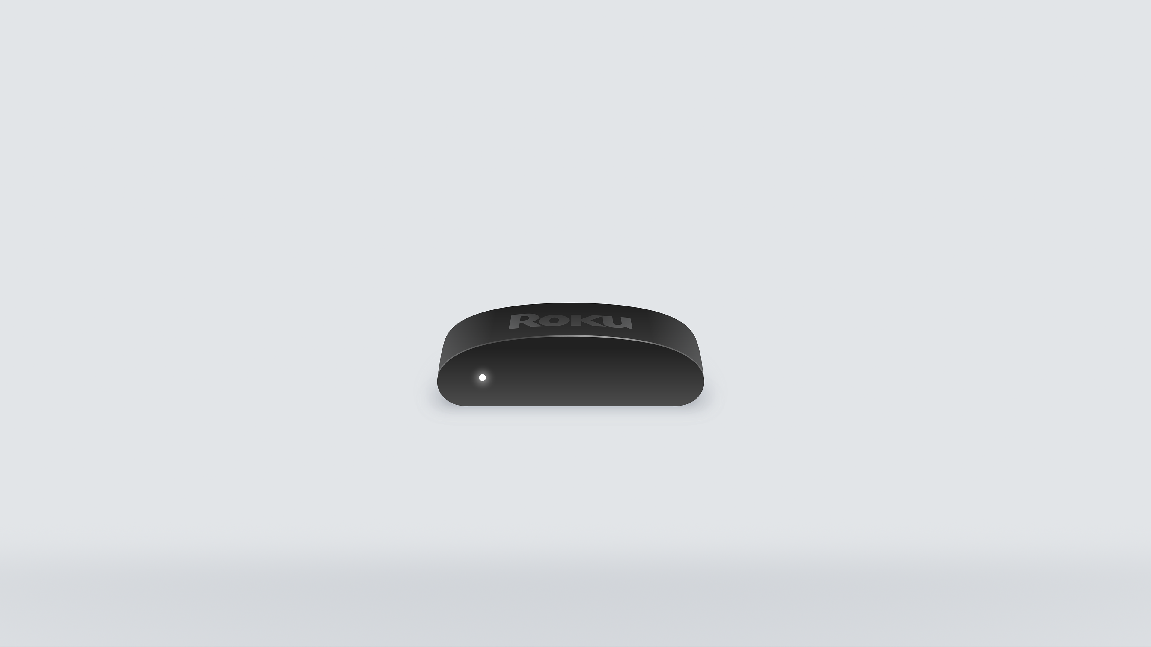
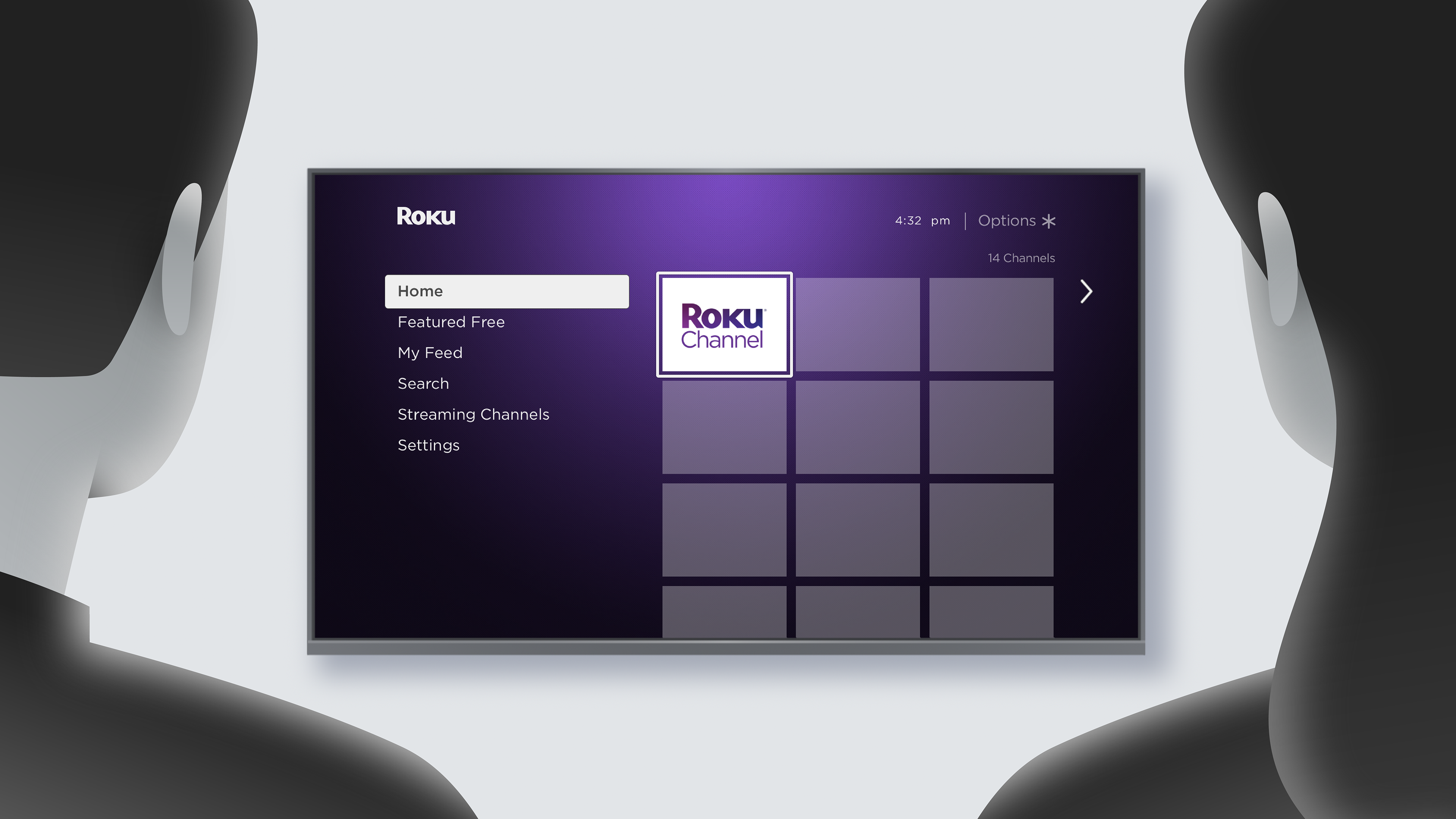
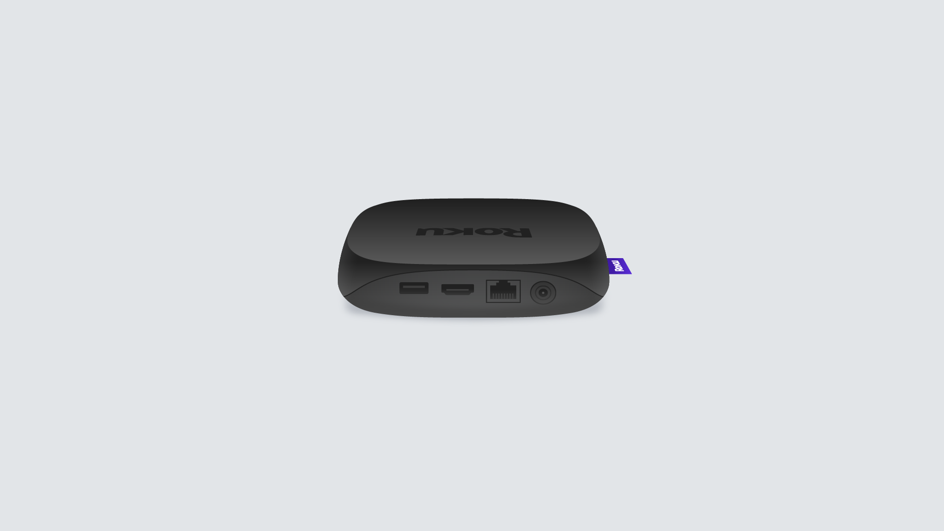
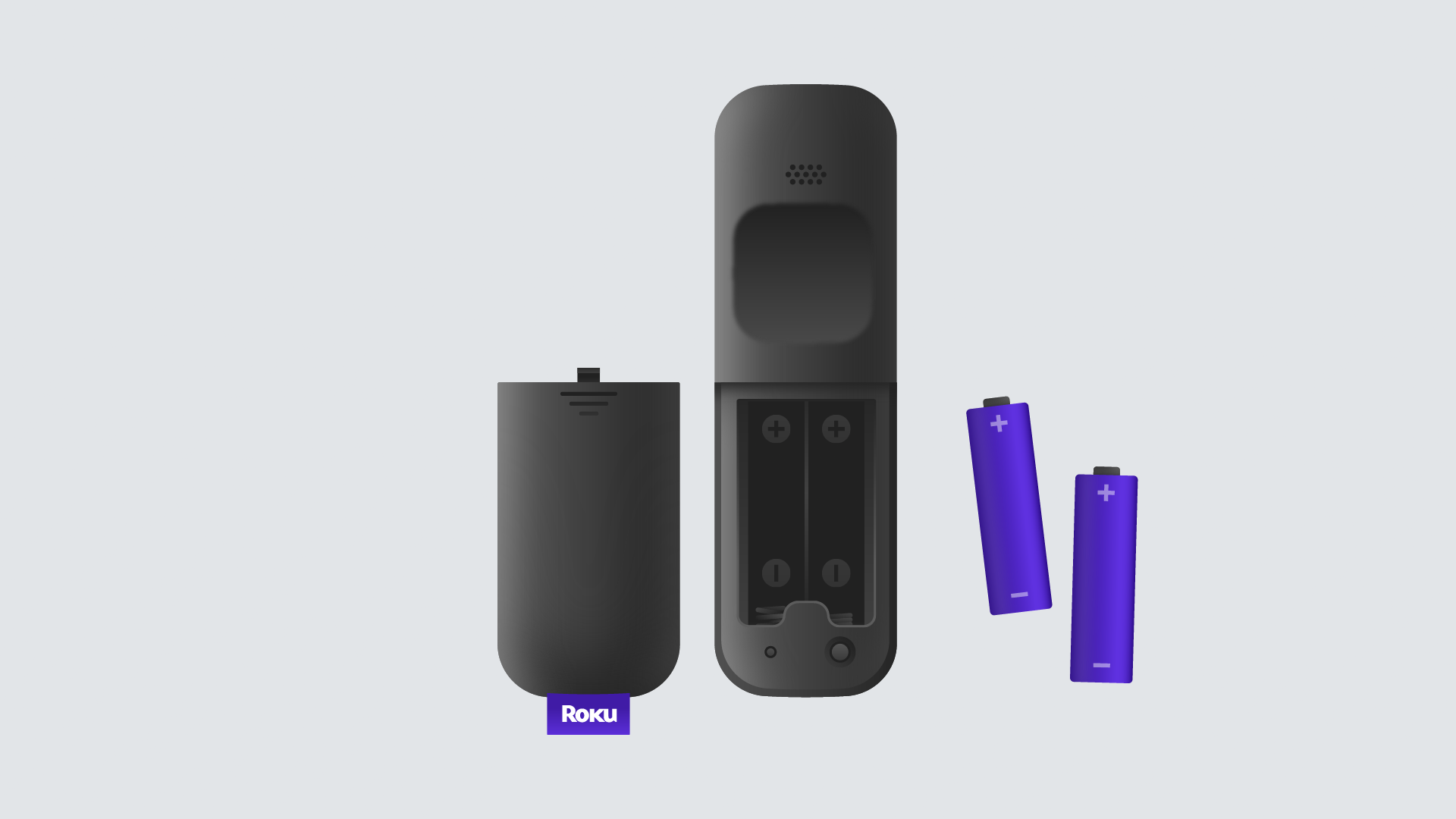
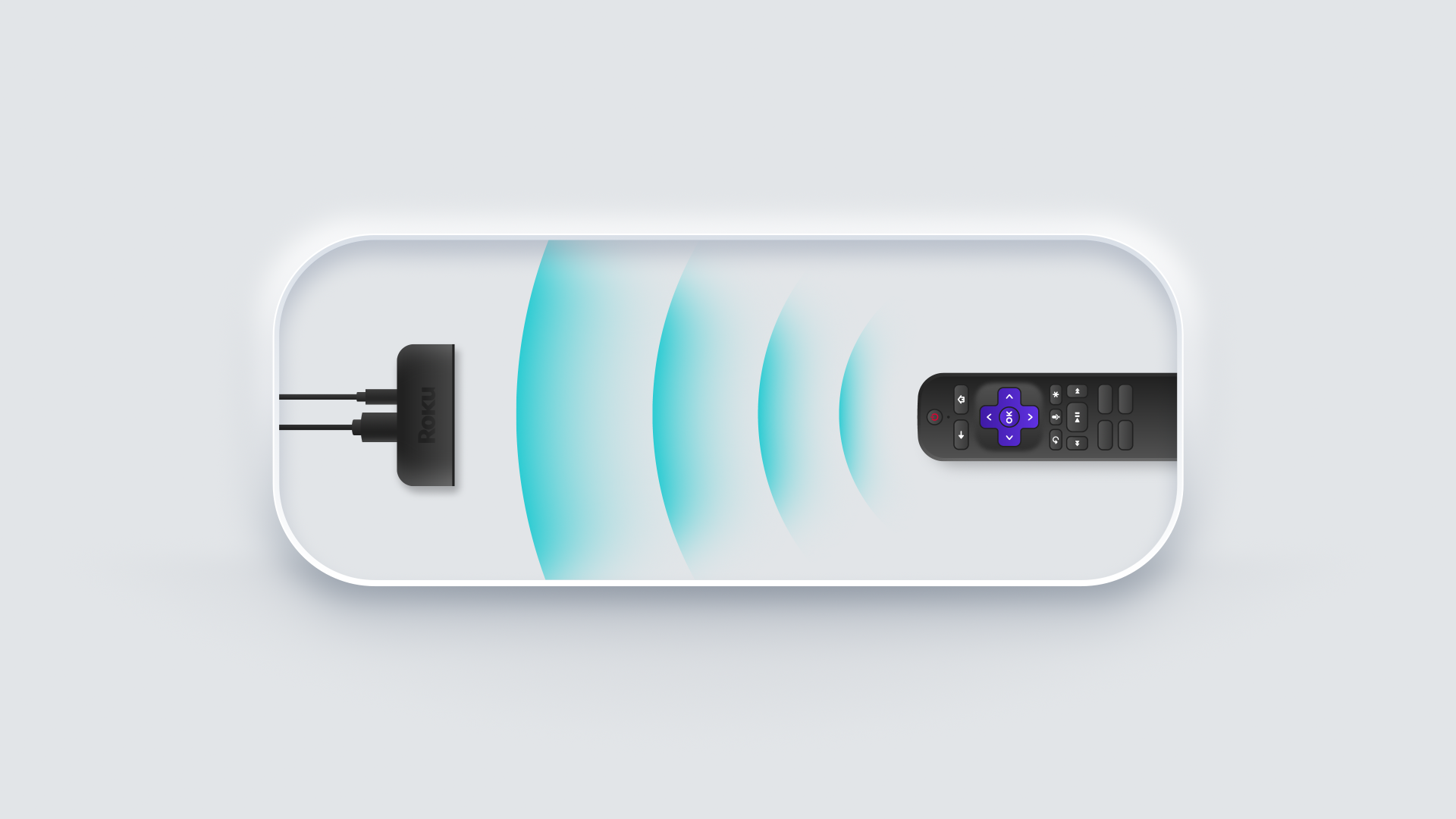
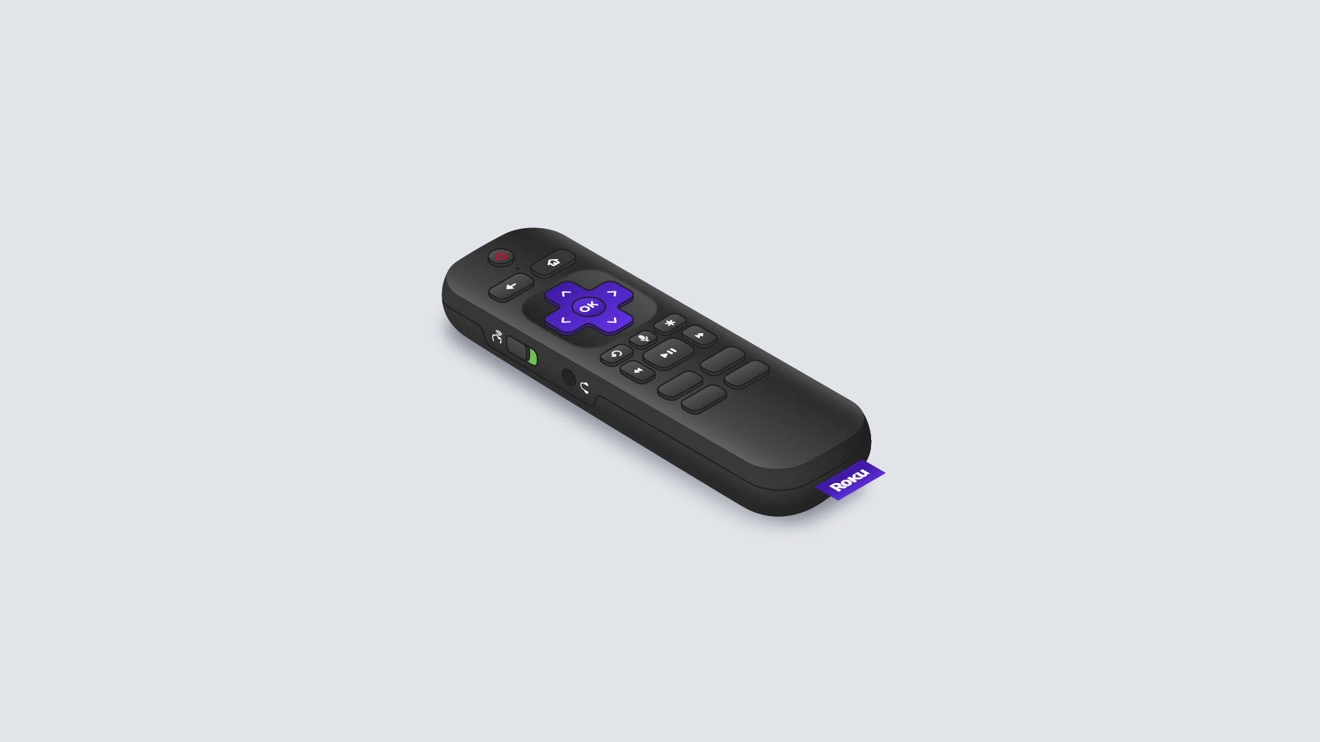
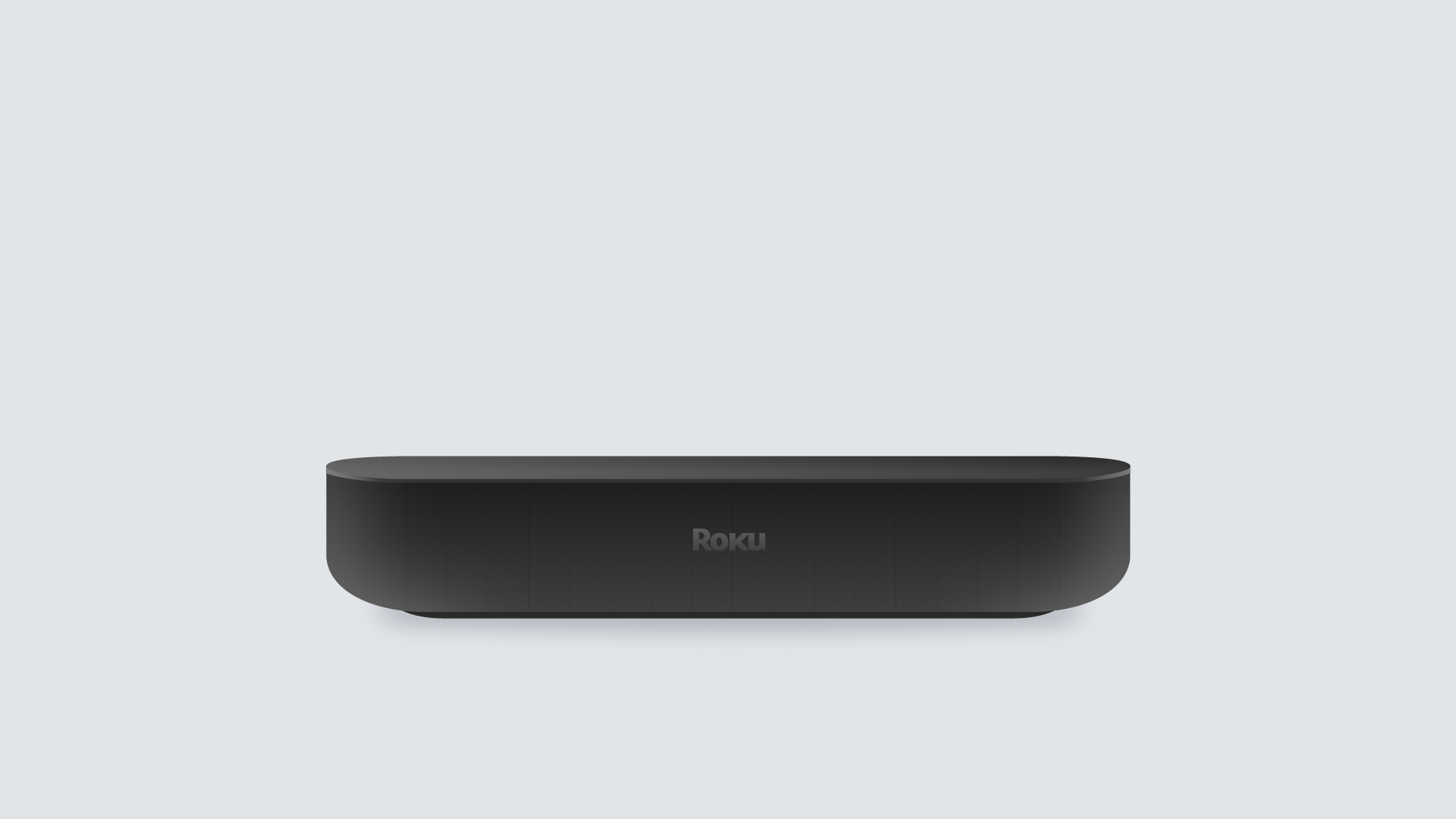
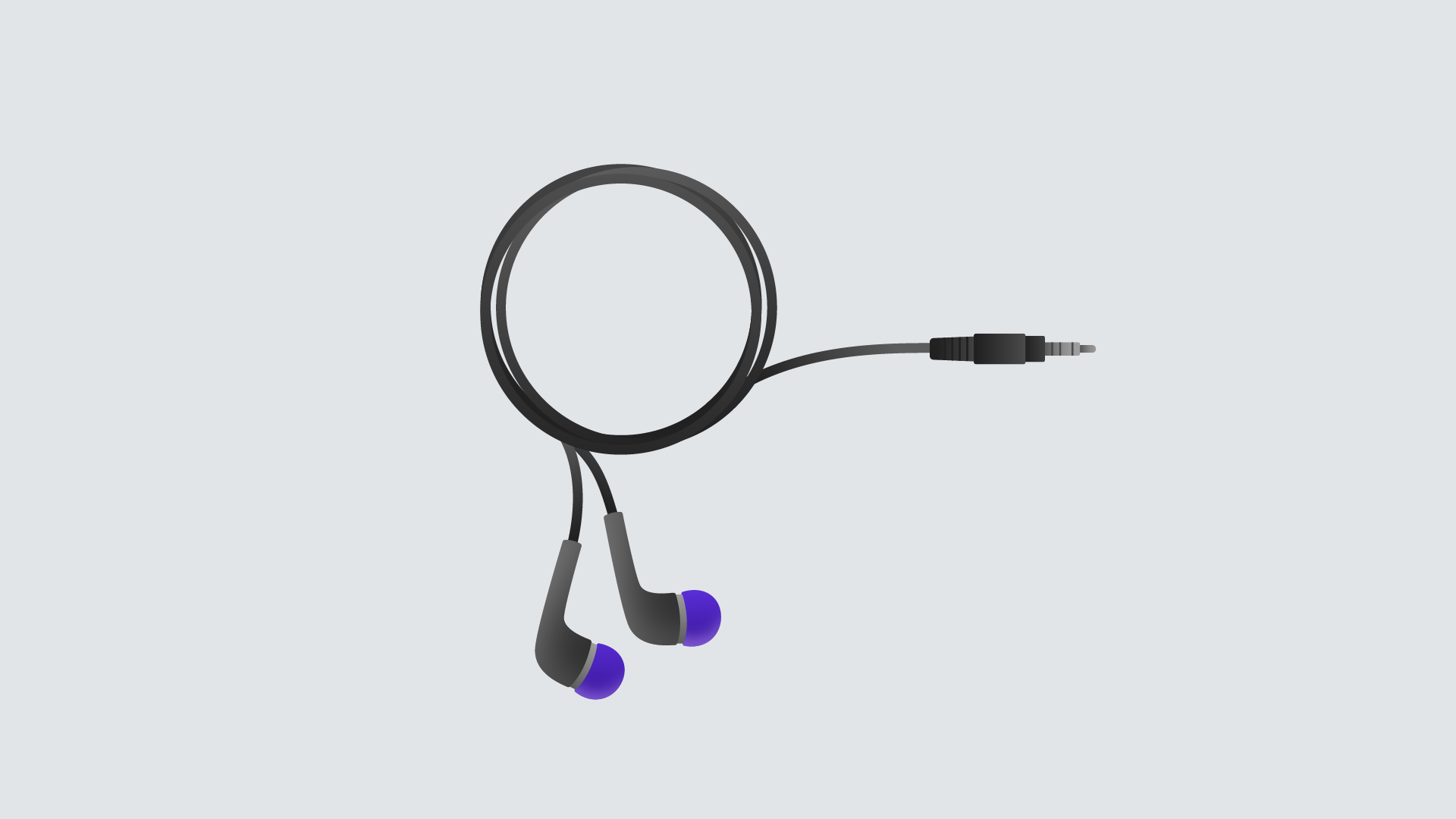
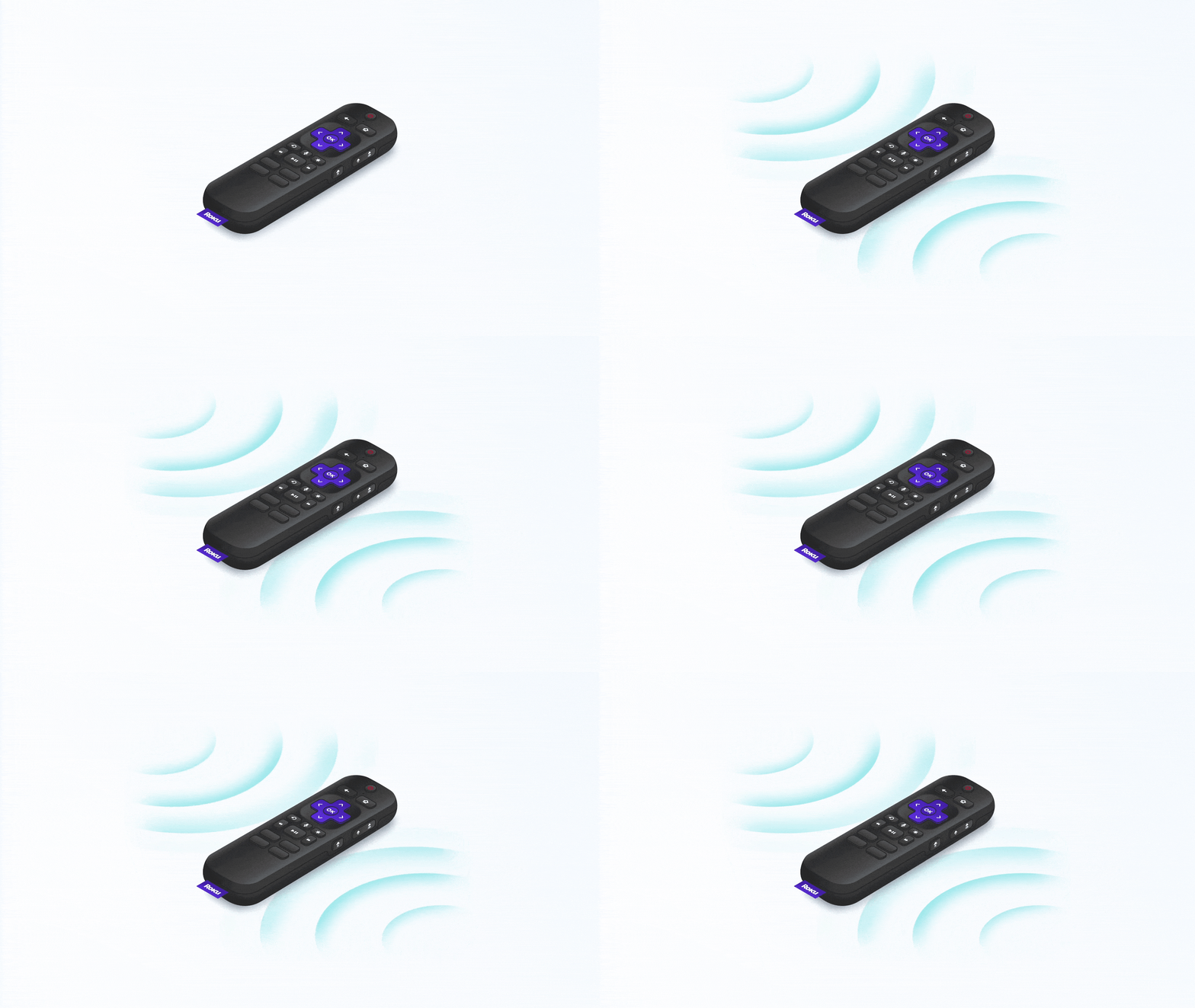
Using Animation Composer, I put together a library of pre-animated scenes and elements that were easy to drag and drop to create consistent animations throughout the videos.

FINAL VIDEOs
Guidelines:
The new channel contains videos made by components in After Effects and an easy-to-use library of animated illustrations.
Videos are meant to be under 60 seconds.
Languages: English, Spanish, UK English, French, Portuguese and German.
Results:
-Deploying a new channel that is accessible in all needed languages ( English, Spanish, Portuguese, French, UK English, and German).
-Using components created in After Effects to minimize the production and translation of the videos.Including templates of the Roku interface which can be used to create customized menus and screens in a short-timed manner.
-Creating a design system library that can be readily available to be used in the production of videos with standardized and simple motion design, which allows to make replicable and consistent videos.
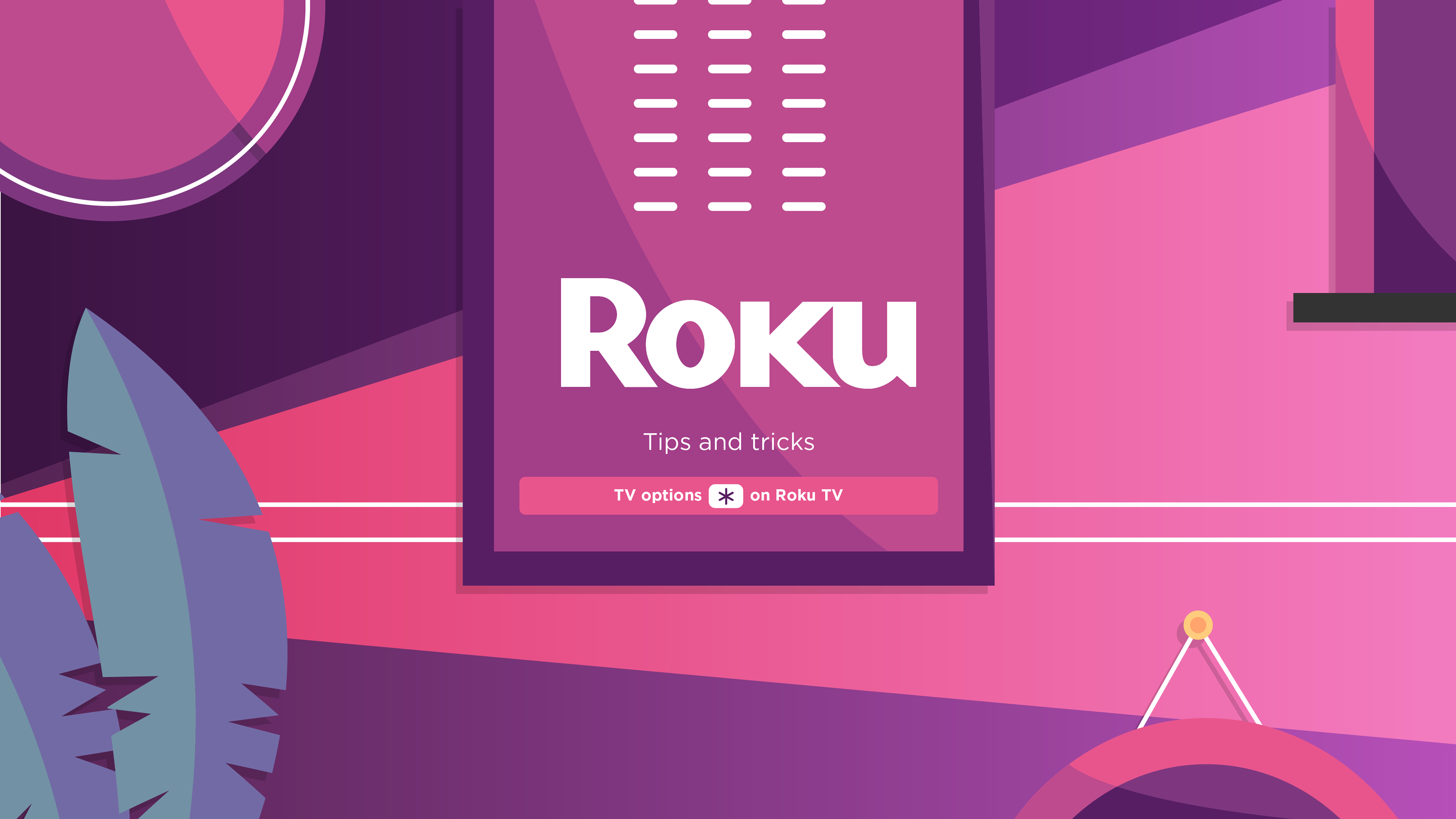
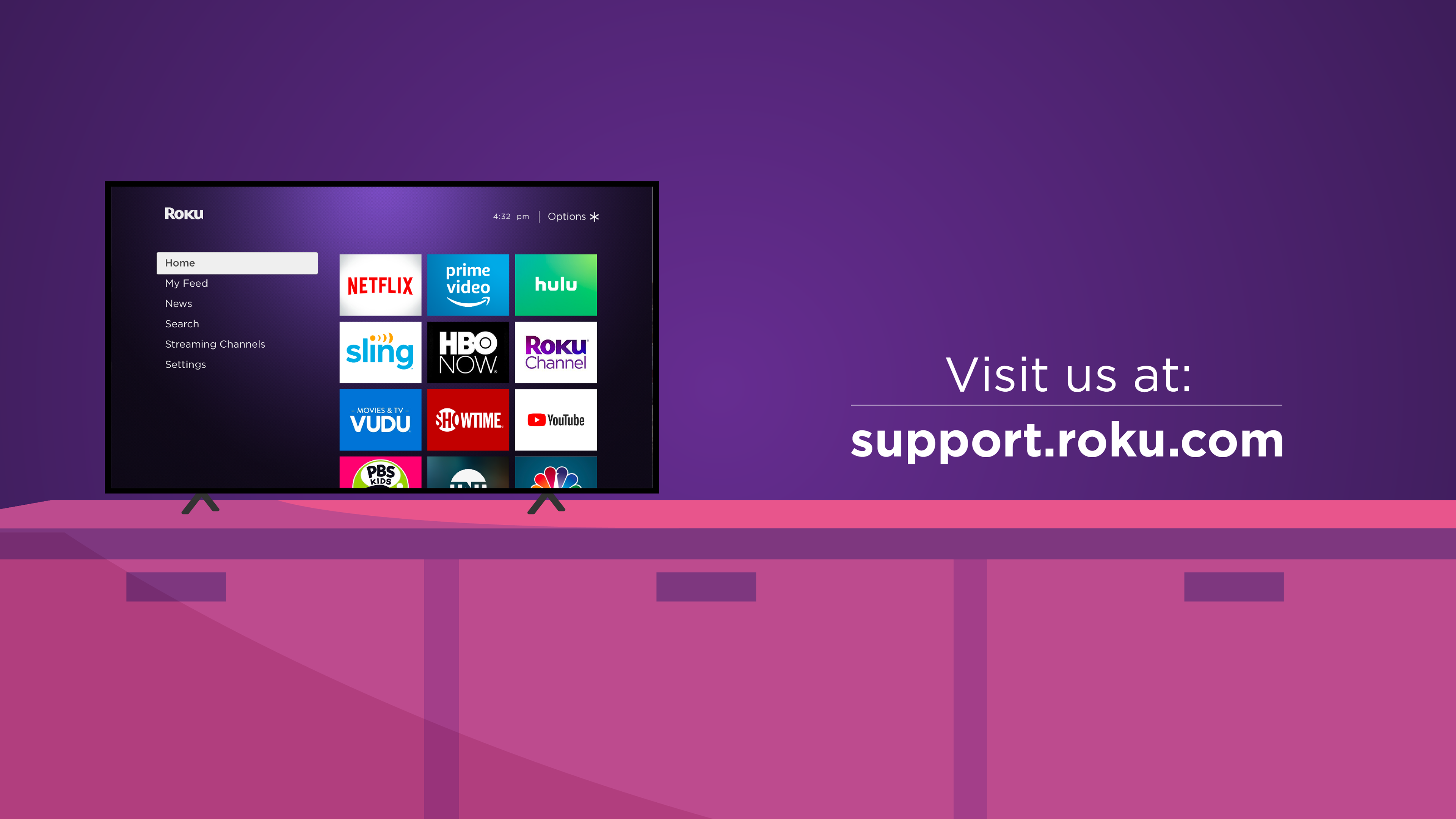
-Videos that are shorter than 60 seconds, which explain a single feature in a simple manner, and which are easy to follow. The end card of the video is meant to summarize the video you just watched and have some key takeaways.
CONTributions:
Created 50% of the videos in the channel. Lead the redesign of the channel, as well as the rebrand. Collaborated with Illustration to create the design system being put in place and animated all assets in the design system.
